Primers • Evaluation Metrics
- Introduction
- Evaluation Metrics for the Classification problem
- Types of prediction errors
- Accuracy
- Confusion Matrix
- Precision and Recall
- \(F_1\) score
- Sensitivity and Specificity
- Putting it together: Precision, Recall/Sensitivity, Specificity, and NPV
- Calculating precision, sensitivity and specificity
- Receiver Operating Characteristic (ROC) Curve
- Detection error tradeoff (DET) curve
- Example Walkthrough with Code
- Evaluation Metrics for the Regression Problem
- Evaluation Metrics for Generative Text Models
- Evaluation Metrics for Generative Image Models
- Evaluation Metrics for Speech Models
- Evaluation Metrics for Clustering
- Evaluation Metrics for Code Generation
- Evaluation Metrics for Compression Models
- Evaluation Metrics for Recommender Systems
- Evaluation Metrics for GAN-based Models
- Further reading
- References
- Citation
Introduction
- Deep learning tasks can be complex and hard to measure: how do we know whether one network is better than another? In some simpler cases such as regression, the loss function used to train a network can be a good measurement of the network’s performance.
- However, for many real-world tasks, there are evaluation metrics that encapsulate, in a single number, how well a network is doing in terms of real world performance. These evaluation metrics allow us to quickly see the quality of a model, and easily compare different models on the same tasks.
- In this section, we review and compare some of the popular evaluation metrics typically used for classification tasks, and how they should be used depending on the the dataset. Next, we also go over how one can tune the probability thresholds for the particularly metrics. Finally, we’ll go through some case studies of different tasks and their metrics.
Evaluation Metrics for the Classification problem
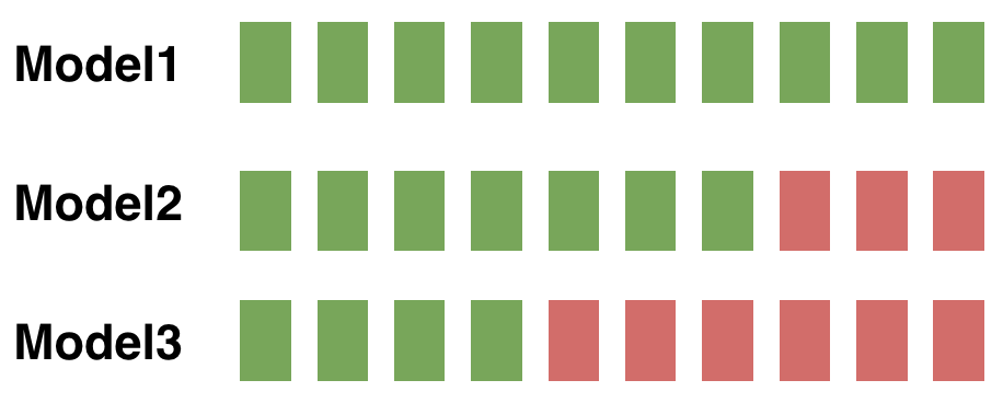
- Let’s consider a simple binary classification problem, where we are trying to predict if a patient is healthy or has pneumonia. We have a test set with 10 patients, where 9 patients are healthy (shown as green squares) and 1 patient has pneumonia (shown as a red square). The ground truth for the test set is shown below (figure source):

- We’ve trained three models for this task (Model1, Model2, Model3), and we’d like to compare the performance of these models. The predictions from each model on the test set are shown below (figure source):
Types of prediction errors
- When making a prediction for a two-class classification problem, the following types of errors can be made by a classifier:
- False Positive (FP): predict an event when there was no event. This is also referred to as a Type I error in statistical hypothesis testing (defined as the mistaken rejection of an actually true null hypothesis).
- False Negative (FN): predict no event when in fact there was an event. This is also referred to as a Type II error in statistical hypothesis testing (defined as the failure to reject a null hypothesis that is actually false).
- True Positive (TP): predict an event when there was an event.
- True Negative (TN): predict no event when in fact there was no event.
- In general, the error type can be interpreted as follows:
- The first word indicates the prediction outcome. If our prediction was correct, it’s true, else it’s false.
- The second word indicates the actual prediction. If our prediction was that an event occurred, it’s positive, else it’s negative.
Accuracy
-
To compare models, we could first use accuracy, which is the fraction of the number of correctly classified examples relative to the total number of examples:
\[\text{Accuracy} = \frac{\sum_{x_i \in X_{test}} \mathbb{1}\{f(x_i) = y_i\}}{\mid X_{test} \mid}\]- For instance, if the classifier is 90% correct, it means that out of 100 instances, it correctly predicts the class for 90 of them.
-
If we use accuracy as the evaluation metric, it seems that the best model is Model1.
- However, accuracy can be misleading if the number of samples per class in the task at hand is unbalanced. Having a dataset with two classes only, where the first class is 90% of the data, and the second completes the remaining 10%. If the classifier predicts every sample as belonging to the first class, the accuracy reported will be of 90% but this classifier is in practice useless. In general, when you have class imbalance (which is most of the time!), accuracy is not a good metric to use. With imbalanced classes, it’s easy to get a high accuracy without actually making useful predictions. So, accuracy as an evaluation metrics makes sense only if the class labels are uniformly distributed.
Confusion Matrix
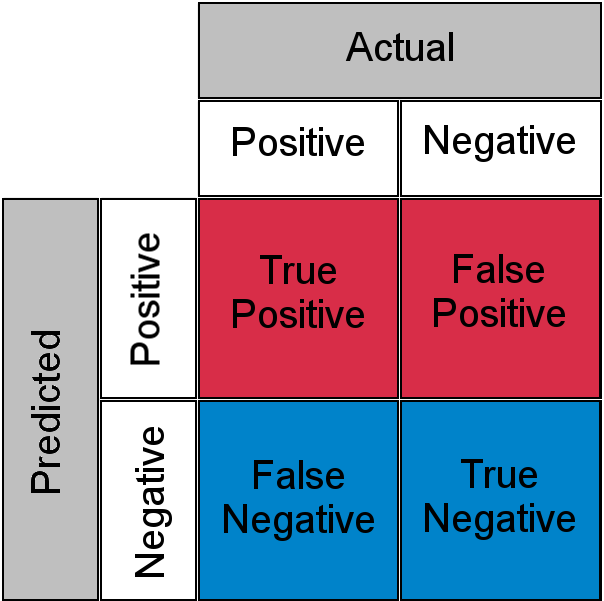
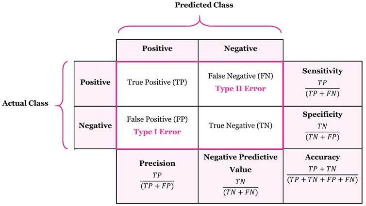
- Accuracy doesn’t discriminate between errors (i.e., it treats misclassifying a patient with pneumonia as healthy the same as misclassifying a healthy patient as having pneumonia). A confusion matrix is a tabular format for showing a more detailed breakdown of a model’s correct and incorrect classifications.
- A confusion matrix for binary classification is shown below (figure source):
Precision and Recall
- In case of an imbalanced dataset scenario (where you have an abundance of negatives and a dearth of positives), precision and recall are appropriate performance metrics. Both precision and recall are focused on the positive class (the minority class) and are unconcerned with the true negatives (majority class). Put simply, precision and recall are the preferred metrics in case of a class imbalance scenario when you have a lot of negatives and a few positives, for e.g., detecting the wakeword in a typical voice assistant pipeline. In other words, precision and recall make it possible to assess the performance of a classifier on the minority class.
- Precision is defined as the fraction of relevant instances among all retrieved instances.
- Recall, sometimes referred to as sensitivity, is the fraction of retrieved instances among all relevant instances.
- Note that precision and recall are computed for each class. They are commonly used to evaluate the performance of classification or information retrieval systems.
A perfect classifier has precision and recall both equal to 1.
- It is often possible to calibrate the number of results returned by a model and improve precision at the expense of recall, or vice versa.
- Precision and recall should always be reported together and are not quoted individually. This is because it is easy to vary the sensitivity of a model to improve precision at the expense of recall, or vice versa.
- As an example, imagine that the manufacturer of a pregnancy test needed to reach a certain level of precision, or of specificity, for FDA approval. The pregnancy test shows one line if it is moderately confident of the pregnancy, and a double line if it is very sure. If the manufacturer decides to only count the double lines as positives, the test will return far fewer positives overall, but the precision will improve, while the recall will go down. This shows why precision and recall should always be reported together.
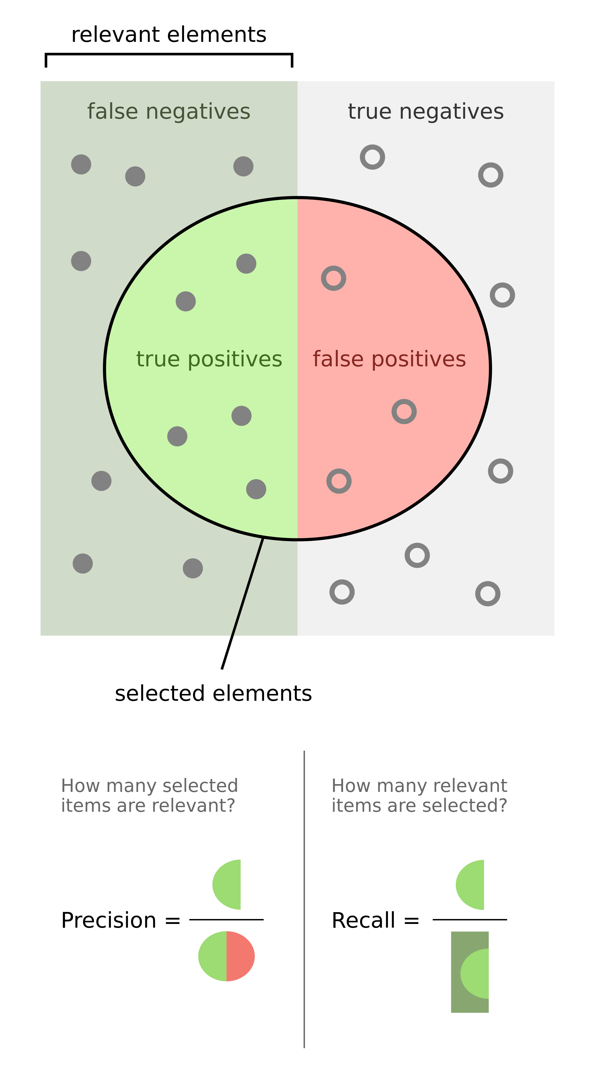
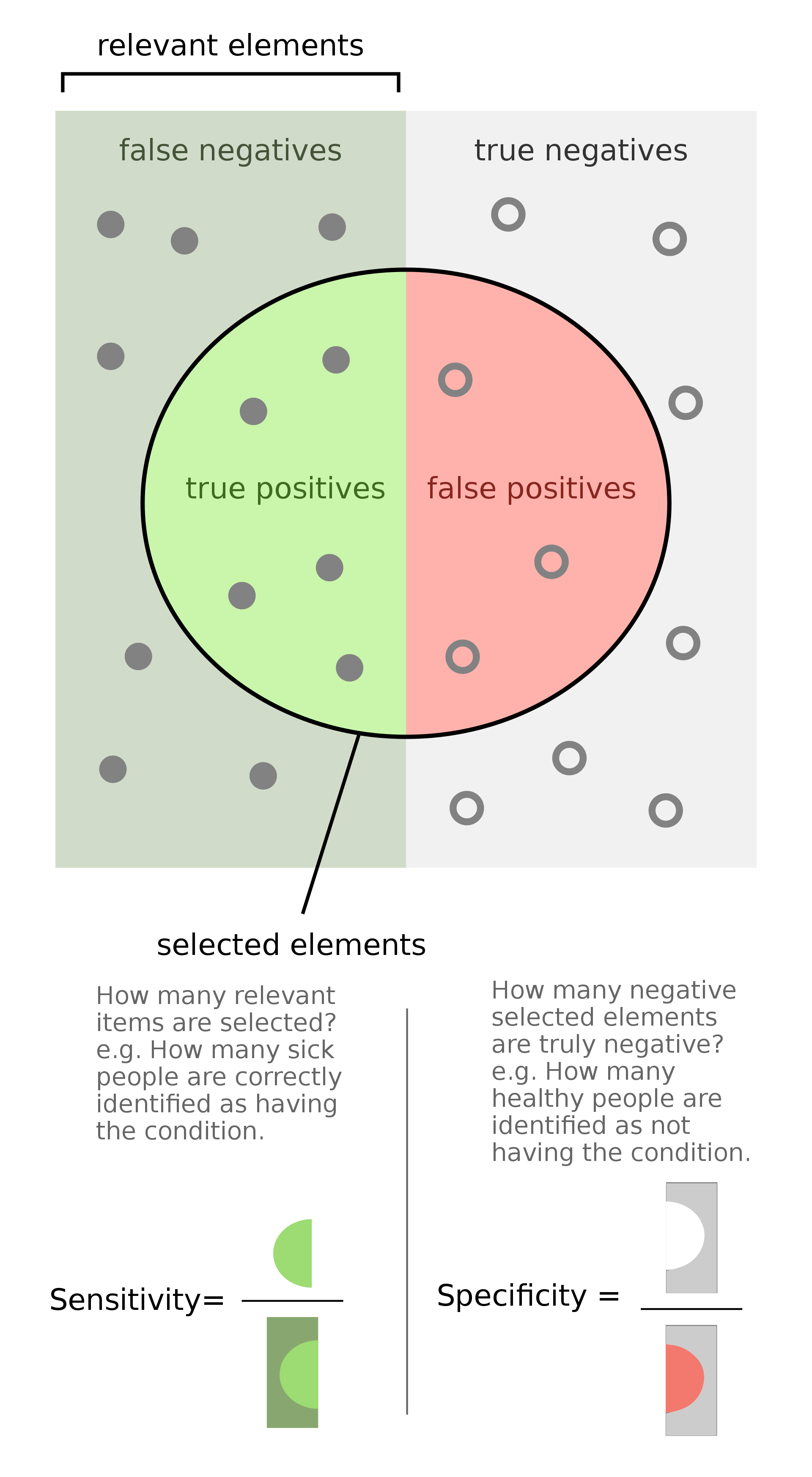
- The figure below (taken from the Wikipedia article on precision and recall) shows a graphical representation of precision and recall:
- Formally, precision and recall can be defined as:
- Precision: Out of all the samples classified positive, how many were actually positive (i.e., the true positives)?
- Recall: Out of all the samples that are actually positive, how many were classified positive (i.e., the true positives)?
- From the above definitions it is clear that with PR metrics, the focus is on the positive class (also called the relevant class).
- Precision and recall are typically juxtaposed together when reported. Also, it is important to note that Precision and Recall can be interpreted as percentages.
- In the section on Precision-Recall (PR) Curves, we explore how to get the best out of these two metrics using PR curves.
- Key takeaways
- In an information retrieval/search context:
- Precision: Of all returned/retrieved/selected items, how many items were relevant?
- Recall: Of all relevant items, how many items were returned/retrieved/selected?
- In a classification context:
- Precision: Of all items predicted/classified/marked as positive, how many were actually positive?
- Recall: Of all positive items, how many did we correctly predict/classify/mark as positive?
- In an information retrieval/search context:
Historical Background
- This section is optional and offers a historical walk-through of how precision, recall and F1-score came about, so you may skip to the next section if so desired.
- Precision and recall were first defined by the American scientist Allen Kent and his colleagues in their 1955 paper Machine literature searching VIII. Operational criteria for designing information retrieval systems.
- Kent served in the US Army Air Corps in World War II, and was assigned after the war by the US military to a classified project at MIT in mechanized document encoding and search.
- In 1955, Kent and his colleagues Madeline Berry, Fred Luehrs, and J.W. Perry were working on a project in information retrieval using punch cards and reel-to-reel tapes. The team found a need to be able to quantify the performance of an information retrieval system objectively, allowing improvements in a system to be measured consistently, and so they published their definition of precision and recall.
- They described their ideas as a theory underlying the field of information retrieval, just as the second law of thermodynamics “underlies the design of a steam engine, regardless of its type or power rating”.
- Since then, the definitions of precision and recall have remained fundamentally the same, although for search engines the definitions have been modified to take into account certain nuances of human behavior, giving rise to the modified metrics precision @ \(k\) and mean average precision (mAP), which are the values normally quoted in information retrieval contexts today.
- In 1979, the Dutch computer science professor Cornelis Joost van Rijsbergen recognized the problems of defining search engine performance in terms of two numbers and decided on a convenient scalar function that combines the two. He called this metric the Effectiveness function and assigned it the letter E. This was later modified to the \(F_1\) score, or \(F_{\beta}\) score, which is still used today to summarize precision and recall.
Examples
- Precision and recall can be best explained using examples. Consider the case of evaluating how well does a robot sifts good apples from rotten apples. A robot looks into the basket and picks out all the good apples, leaving the rotten apples behind, but is not perfect and could sometimes mistake a rotten apple for a good apple orange.
- After the robot finishes picking the good apples, precision and recall can be calculated as:
- Precision: number of good apples picked out of all the picked apples.
- Recall: number of good apples picked out of all possible good apples.
- Precision is about exactness, classifying only one instance correctly yields 100% precision, but a very low recall, it tells us how well the system identifies samples from a given class.
- Recall is about completeness, classifying all instances as positive yields 100% recall, but a very low precision, it tells how well the system does and identify all the samples from a given class.
- As another example, consider the task of information retrieval. As such, precision and recall can be calculated as:
- Precision: number of relevant documents retrieved out of all retrieved documents.
- Recall: number of relevant documents retrieved out of all relevant documents.
Applications
- Precision and recall are measured for every possible class in the dataset. So, precision and recall metrics are relatively much more appropriate (especially compared to accuracy) when dealing with imbalanced classes.
An important point to note is that PR are able to handle class imbalance in scenarios where the positive class (also called the minority class) is rare. If, however, the dataset is imbalanced in such a way that the negative class is the one that’s rare, PR curves are sub-optimal and can be misleading. In these cases, ROC curves might be a better fit.
- So when do we use PR metrics? Here’s the typical use-cases:
- When two classes are equally important: PR would be the metrics to use if the goal of the model is to perform equally well on both classes. Image classification between cats and dogs is a good example because the performance on cats is equally important on dogs.
- When minority class is more important: PR would be the metrics to use if the focus of the model is to identify correctly as many positive samples as possible. Take spam detectors for example, the goal is to find all the possible spam emails. Regular emails are not of interest at all — they overshadow the number of positives.
Formulae
-
Mathematically, precision and recall are defined as,
\[\operatorname {Precision}=\frac{TP}{TP + FP} \\\] \[\operatorname{Recall}=\frac{TP}{TP + FN} \\\]- where,
- \(TP\) is the True Positive Rate, i.e., the number of instances which are relevant and which the model correctly identified as relevant.
- \(FP\) is the False Positive Rate, i.e., the number of instances which are not relevant but which the model incorrectly identified as relevant.
- \(FN\) is the false negative rate, i.e., the number of instances which are relevant and which the model incorrectly identified as not relevant.
- where,
-
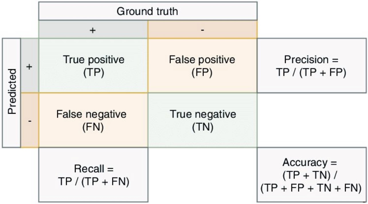
The following figure shows a confusion matrix (figure source), linking the formulae for accuracy, precision, and recall with the components of a confusion matrix.
-
In the content of the robot sifting good apples from the rotten ones (i.e., a classification use-case),
\[\operatorname {Precision}=\frac{\text { # of picked good apples }}{\text { # of picked apples }}\] \[\operatorname{Recall}=\frac{\text { # of picked good apples }}{\text { # of good apples }}\] -
In the context of a document search system (i.e., a information retrieval use-case),
\[\operatorname {Precision}=\frac{\text { retrieved relevant documents }}{\text { all retrieved documents }}\] \[\operatorname{Recall}=\frac{\text { retrieved relevant documents }}{\text { all relevant documents }}\]
Memory Map for Precision/Recall Formulae
- The formula for precision follows the triple-P rule: calculation of Precision related to terms of True Positive and False Positive, which is one half of the confusion matrix.

- The formula for recall is related to the first row of terms in the confusion matrix.

Precision/Recall Tradeoff
- Because high precision and high recall are what every model optimizes for. However, depending on the problem at hand, you either care about high precision or high recall.
- Examples of high precision:
- For a model that detects shop lifters, the focus should be on developing a high precision model by reducing false positives (note that precision is given by \(\frac{TP}{TP+FP}\) and since \(FP\) features in the denominator, reducing \(FP\) leads to high precision). This implies that if we tag someone as a shop lifter, we’d like to make sure we do so with high confidence.
- Examples of high recall:
- In an adult content detection problem, the focus should be on developing a high recall model by reducing false negatives (note that recall is given by \(\frac{TP}{TP+FN}\) and since \(FN\) features in the denominator, reducing \(FN\) leads to high recall). This implies that if the model classified a video as good for kids (i.e., not having adult content), it should be marked so with high confidence.
- In a disease detection scenario, the focus should be on developing a high recall model by reducing false negatives. This implies that if the model classified a patient as not having the disease, it should be done do with high confidence else it can prove fatal.
- In an autonomous car driving scenario, the focus should be on developing a high recall model by reducing false negatives. This implies that if the model determined that there was no obstacle in the car’s surrounding radius, it should be done do with high confidence else fatalities can occur.
- Often, there is an inverse relationship between precision and recall, where it is possible to increase one at the cost of reducing the other. This is called the precision/recall tradeoff. However, in some scenarios, it is important to strike the right balance between both:
- As an example (from the Wikipedia article on Precision and Recall), brain surgery provides an illustrative example of the tradeoff. Consider a brain surgeon removing a cancerous tumor from a patient’s brain. The surgeon needs to remove all of the tumour cells since any remaining cancer cells will regenerate the tumor. Conversely, the surgeon must not remove healthy brain cells since that would leave the patient with impaired brain function. The surgeon may be more liberal in the area of the brain he removes to ensure he has extracted all the cancer cells. This decision increases recall but reduces precision. On the other hand, the surgeon may be more conservative in the brain he removes to ensure he extracts only cancer cells. This decision increases precision but reduces recall. That is to say, greater recall increases the chances of removing healthy cells (negative outcome) and increases the chances of removing all cancer cells (positive outcome). Greater precision decreases the chances of removing healthy cells (positive outcome) but also decreases the chances of removing all cancer cells (negative outcome).
- In terms of restrictiveness, making the system more restrictive leads to reducing FPs, in turn improving precision. On the other hand, making the system less restrictive leads to reducing FNs, in turn improving recall. Furthermore, in recommender systems, increasing recall has the benefit of showing related results (say, looking up with an item on a restaurant’s menu and seeing similar items with it in your search results), leading to improved discovery.
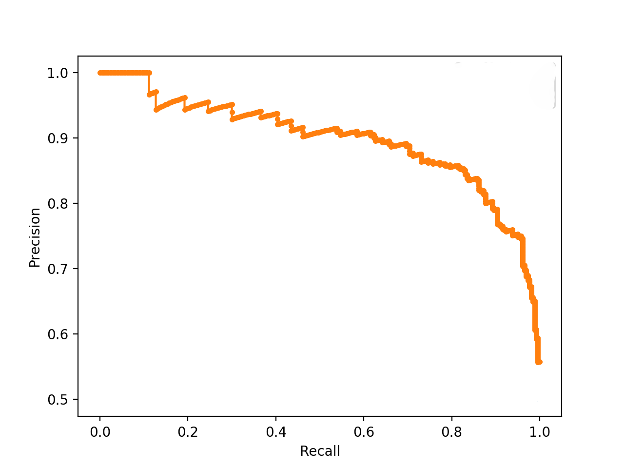
- The following plot (source) shows the Precision-Recall tradeoff. As we increase the recall rate by adjusting the classification threshold of a model, the precision rate is decreased and vice versa.
Range of Precision, Recall, and F1-Score
-
The range of precision, recall, and F1-score in binary classification tasks is from 0 to 1. Here’s a brief overview of each metric and its range:
- Precision:
- Definition: Precision is the ratio of true positive predictions to the total number of positive predictions made by the model (true positives + false positives).
- Range: 0 to 1, where 1 indicates perfect precision (no false positives) and 0 indicates that no positive predictions were correct.
- Recall:
- Definition: Recall, also known as sensitivity or true positive rate, is the ratio of true positive predictions to the total number of actual positives (true positives + false negatives).
- Range: 0 to 1, where 1 indicates perfect recall (no false negatives) and 0 indicates that no true positives were identified.
- F1-score:
- Definition: The F1-score is the harmonic mean of precision and recall, providing a single metric that balances both.
- Range: 0 to 1, where 1 indicates the best balance between precision and recall, and 0 indicates that either precision, recall, or both are 0.
- Precision:
-
In all cases, a value closer to 1 indicates better performance.
When F1-Score Becomes Misleading Under Negative-Class Imbalance
-
While the F1-score is widely adopted as a balanced summary of precision and recall, it can be inappropriate in certain problem formulations, particularly under asymmetric error costs or atypical class imbalance structures.
-
A commonly recognized limitation arises when the cost of false positives substantially exceeds that of false negatives. In such cases, a generalized \(F_{\beta}\)-score with \(\beta < 1\) is more appropriate, as it assigns greater weight to precision relative to recall. The standard F1-score corresponds to the special case \(\beta = 1\), which assumes equal importance.
-
A less frequently discussed, yet practically important, scenario occurs when the dataset exhibits imbalance in the negative class. That is, the positive class dominates, resulting in a high-prevalence setting with many true positives and relatively few true negatives. In such contexts, the modeling objective is often to accurately identify the rare negative instances.
-
This scenario exposes a structural limitation of precision and recall: both metrics are entirely insensitive to true negatives. Specifically:
- Precision evaluates the proportion of predicted positives that are correct and does not incorporate true negatives.
- Recall evaluates the proportion of actual positives that are correctly identified and similarly excludes true negatives.
-
Consequently, when true negatives are both rare and critical, precision, recall, and by extension the F1-score fail to adequately capture model performance on the most important subset of data.
-
This issue can be further understood through an information-theoretic lens. In high-prevalence settings, such as an LLM-as-a-judge task with 95 percent correct and 5 percent incorrect responses, the rare negative class carries disproportionately high informational value or “surprisal.” These instances represent the most informative and challenging regions of the distribution. However, because F1 entirely ignores the negative complement, it effectively becomes a degenerate evaluation function in this regime. It attempts to summarize model performance while systematically excluding the portion of the distribution where the most consequential errors occur.
-
In such cases, metrics that evaluate the joint behavior of all components of the confusion matrix are more appropriate. One notable example is the Matthews Correlation Coefficient (MCC), which incorporates all four quantities ((TP, TN, FP, FN)) and provides a symmetric assessment of performance across both classes. This prevents models from achieving artificially favorable scores by exploiting majority-class dominance in either direction.
-
Alternative approaches include macro-averaged F1, which gives equal weight to each class irrespective of prevalence. While this partially mitigates imbalance effects, it still inherits the fundamental limitations of F1 at the per-class level and may not fully address the neglect of true negatives.
-
To address misalignment more generally, two complementary strategies may be employed:
- Reformulate the task such that the minority or critical class is treated as the positive class.
- Adopt evaluation metrics that explicitly account for true negatives, such as negative predictive value (NPV), specificity, MCC, or related symmetric measures.
-
These considerations underscore a broader point: binary classification evaluation is inherently non-intuitive, and even widely accepted metrics can yield misleading conclusions when applied without careful attention to class distribution, information density, and the relative importance of different error types.
Case studies
Disease diagnosis
- Consider our classification problem of pneumonia detection. It is crucial that we find all the patients that are suffering from pneumonia. Predicting patients with pneumonia as healthy is not acceptable (since the patients will be left untreated).
- Thus, a natural question to ask when evaluating our models is: Out of all the patients with pneumonia, how many did the model predict as having pneumonia? The answer to this question is given by the recall.
- The recall for each model is given by:
- Imagine that the treatment for pneumonia is very costly and therefore you would also like to make sure only patients with pneumonia receive treatment.
- A natural question to ask would be: Out of all the patients that are predicted to have pneumonia, how many actually have pneumonia? This metric is the precision.
- The precision for each model is given by:
Search engine
- Imagine that you are searching for information about cats on your favorite search engine. You type ‘cat’ into the search bar.
- The search engine finds four web pages for you. Three pages are about cats, the topic of interest, and one page is about something entirely different, and the search engine gave it to you by mistake. In addition, there are four relevant documents on the internet, which the search engine missed.

-
In this case we have three true positives, so \(TP=3\). There is one false positive, \(FP=1\). And there are four false negatives, so \(FN=4\). Note that to calculate precision and recall, we do not need to know the total number of true negatives (the irrelevant documents which were not retrieved).
-
The precision is given by,
- While the recall is given by,
Precision-Recall Curve
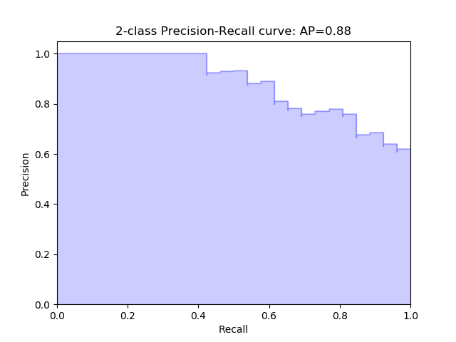
- In the section on Precision and Recall, we see that when a dataset has imbalanced classes, precision and recall are better metrics than accuracy. Similarly, for imbalanced classes, a Precision-Recall curve is more suitable than a ROC curve.
- A Precision-Recall curve is a plot of the Precision (y-axis) and the Recall (x-axis) for different thresholds, much like the ROC curve. Note that in computing precision and recall there is never a use of the true negatives, these measures only consider correct predictions.
Area Under the PR Curve (AUPRC)
- Similar to the AUROC, the AUPRC summarizes the curve with a range of threshold values as a single score.
- The score can then be used as a point of comparison between different models on a binary classification problem where a score of 1.0 represents a model with perfect skill.
Key takeaways: Precision, Recall and ROC/PR Curves
- ROC Curve: summaries the trade-off between the True Positive Rate and False Positive Rate for a predictive model using different probability thresholds.
- Precision-Recall Curve: summaries the trade-off between the True Positive Rate and the positive predictive value for a predictive model using different probability thresholds.
- In the same way it is better to rely on precision and recall rather than accuracy in an imbalanced dataset scenario (since it can offer you an incorrect picture of the classifier’s performance), a Precision-Recall curve is better to calibrate the probability threshold compared to the ROC curve. In other words, ROC curves are appropriate when the observations are balanced between each class, whereas precision-recall curves are appropriate for imbalanced datasets. In both cases, the area under the curve (AUC) can be used as a summary of the model performance.
| Metric | Formula | Description |
|---|---|---|
| Accuracy | $$\frac{TP+TN}{TP+TN + FP+FN}$$ | Overall performance of model |
| Precision | $$\frac{TP}{TP + FP}$$ | How accurate the positive predictions are |
| Recall/Sensitivity | $$\frac{TP}{TP + FN}$$ | Coverage of actual positive sample |
| Specificity | $$\frac{TN}{TN + FP}$$ | Coverage of actual negative sample |
| F1-score | $$2 \times\frac{\textrm{Precision} \times \textrm{Recall}}{\textrm{Precision} + \textrm{Recall}}$$ | Harmonic mean of Precision and Recall |
\(F_1\) score
- Precision and recall are both useful, but having multiple evaluation metrics makes it difficult to directly compare models. From Andrew Ng’s Machine Learning Yearning:
“Having multiple-number evaluation metrics makes it harder to compare algorithms. Better to combine them to a single evaluation metric. Having a single-number evaluation metric speeds up your ability to make a decision when you are selecting among a large number of classifiers. It gives a clear preference ranking among all of them, and therefore a clear direction for progress.”
- Furthermore, considering the Precision Recall tradeoff, a balancing metric that combines the two terms is helpful. The \(F_1\) score is the harmonic mean of the precision and recall. The \(F_1\) score eases comparison of different systems, and problems with many classes. It is mathematically defined as:
- If we consider either precision or recall to be more important than the other, then we can use the \(F_{\beta}\) score, which is a weighted harmonic mean of precision and recall. This is useful, for example, in the case of a medical test, where a false negative may be extremely costly compared to a false positive. The \(F_{\beta}\) score formula is more complex:
- Since Precision and Recall can be interpreted as percentages (as highlighted in the Precision and Recall section earlier), their arithmetic mean would be also a percentage. Since \(F_1\) score is actually the harmonic mean of the two; analogously it can be also be expressed as a percentage value.
- More on the F-Beta score here.
Calculating \(F_1\) score
- Imagine that we consider precision and recall to be of equal importance for our purposes. In this case, we will use the \(F_1\)-score to summarize precision and recall together.
- For the above example of disease diagnosis, let’s calculate the \(F_1\) score for each model based on the numbers for precision and recall,
- For the above example of a search engine, let’s plug in the numbers for precision and recall into the formula for \(F_1\)-score,
- Note that the \(F_1\) score of 0.55 lies between the precision and recall values of 0.75 and 0.43 respectively. This illustrates how the \(F_1\) score can be a convenient way of averaging the precision and recall in order to condense them into a single number.
Sensitivity and Specificity
- When we need to express model performance in two numbers, an alternative two-number metric to precision and recall is sensitivity and specificity. This is commonly used for medical stated sensitivity and specificity for a device or testing kit printed on the side of the box, or in the instruction leaflet.
- Sensitivity and specificity can be defined as follows:
- Sensitivity: can be thought of as the extent to which actual positives are not overlooked, so false negatives are few. Note that sensitivity is the same as recall.
- Specificity: also called the true negative rate, measures the proportion of actual negatives that are correctly identified as such, i.e., is the extent to which actual negatives are classified as such (so false positives are few).
- Mathematically, sensitivity and specificity can be defined as:
- In the context of identifying the number of people with a disease,
- Sensitivity therefore quantifies the avoiding of false negatives, and specificity does the same for false positives.
- Specificity also uses \(TN\), the number of true negatives. This means that sensitivity and specificity use all four numbers in the confusion matrix, as opposed to precision and recall which only use three.
- The number of true negatives corresponds to the number of patients identified by the test as having the disease when they did not have the disease, or alternatively the number of irrelevant documents which the search engine did not retrieve.
- Taking a probabilistic interpretation, we can view specificity as the probability of a negative test given that the patient is well, while the sensitivity is the probability of a positive test given that the patient has the disease.
- The figure below (taken from the Wikipedia article on sensitivity and specificity) shows a graphical representation of sensitivity and specificity:
- Key takeaways
- Sensitivity: how many relevant items are selected?
- Specificity: how many negative selected elements items are truly negative?
Precision and Recall vs. Sensitivity and Specificity
- Sensitivity and specificity are preferred to precision and recall in the medical domain, while precision and recall are the most commonly used metrics for information retrieval. This initially seems strange, since both pairs of metrics are measuring the same thing: the performance of a binary classifier.
- The reason for this discrepancy is that when we are measuring the performance of a search engine, we only care about the returned results, so both precision and recall are measured in terms of the true and false positives. However, if we are testing a medical device, it is important to take into account the number of true negatives, since these represent the large number of patients who do not have the disease and were correctly categorized by the device.
- In medical context, here’s scenarios where focusing on one of these two might be important:
- Sensitivity: the percentage of sick people who are correctly identified as having the condition.
- Specificity: the percentage of healthy people who are correctly identified as not having the condition.
Putting it together: Precision, Recall/Sensitivity, Specificity, and NPV
- The following table (source) packs all of the metrics that we discussed above:
Calculating precision, sensitivity and specificity
- Let’s calculate the precision, sensitivity and specificity for the below example of disease diagnosis.
- Suppose we have a medical test which is able to identify patients with a certain disease.
- We test 20 patients and the test identifies 8 of them as having the disease.
- Of the 8 identified by the test, 5 actually had the disease (true positives), while the other 3 did not (false positives).
- We later find out that the test missed 4 additional patients who turned out to really have the disease (false negatives).
- We can represent the 20 patients using the following confusion matrix:
| True state of patient's health | |||
|---|---|---|---|
| Disease | No disease | ||
| Test result | Alert | 5 | 3 |
| No alert | 4 | 8 | |
-
The relevant values for calculating precision and recall are \(TP=5\), \(FP=3,\) and \(FN=4\). Plugging in these values into the formulae for precision and recall, we obtain:
\[\begin{aligned} \operatorname{ Precision } &=\frac{TP}{TP + FP} \\ &=\frac{5}{5+3} \\ &=0.625 \\ \operatorname{Recall} &=\frac{TP}{TP + FN} \\ &=\frac{5}{5+4} \\ &=0.56 \end{aligned}\] -
Next, the relevant values for calculating sensitivity and specificity are \(TP=5, FP=3,\) and \(TN=8\). Note that sensitivity comes out as the same value as recall, as expected:
\[\begin{aligned} \operatorname { Sensitivity } &=\frac{TP}{TP + FN} \\ &=\frac{5}{5+4} \\ &=0.56 \end{aligned}\]- whereas specificity gives:
Applications in Information Retrieval
- Precision and recall are best known for their use in evaluating search engines and other information retrieval systems.
- Search engines must index large numbers of documents, and display a small number of relevant results to a user on demand. It is important for the user experience to ensure that both all relevant results are identified, and that as few as possible irrelevant documents are displayed to the user. For this reason, precision and recall are the natural choice for quantifying the performance of a search engine, with some small modifications.
- Over 90% of users do not look past the first page of results. This means that the results on the second and third pages are not very relevant for evaluating a search engine in practice. For this reason, rather than calculating the standard precision and recall, we often calculate the precision for the first 10 results and call this precision @ 10. This allows us to have a measure of the precision that is more relevant to the user experience, for a user who is unlikely to look past the first page. Generalizing this, the precision for the first \(k\) results is called the precision @ \(k\).
- In fact, search engine overall performance is often expressed as mean average precision, which is the average of precision @ \(k\), for a number of \(k\) values, and for a large set of search queries. This allows an evaluation of the search precision taking into account a variety of different user queries, and the possibility of users remaining on the first results page, vs. scrolling through to the subsequent results pages.
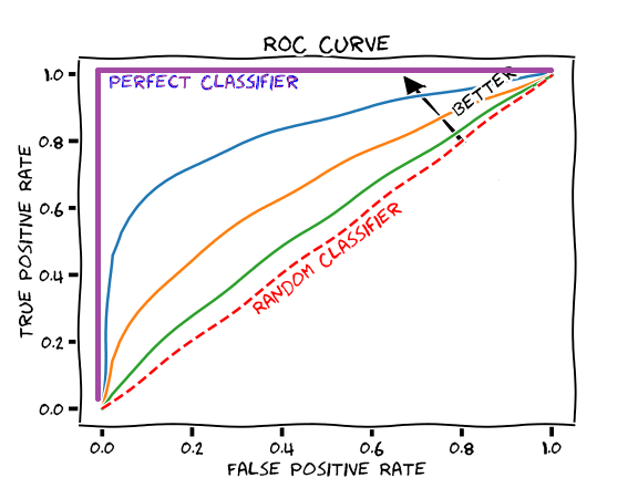
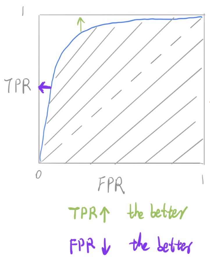
Receiver Operating Characteristic (ROC) Curve
- Suppose we have the probability prediction for each class in a multiclass classification problem, and as the next step, we need to calibrate the threshold on how to interpret the probabilities. Do we predict a positive outcome if the probability prediction is greater than 0.5 or 0.3? The Receiver Operating Characteristic (ROC) curve ROC helps answer this question.
- Adjusting threshold values like this enables us to improve either precision or recall at the expense of the other. For this reason, it is useful to have a clear view of how the False Positive Rate and True Positive Rate vary together.
- The ROC curve shows the variation of the error rates for all values of the manually-defined threshold. The curve is a plot of the False Positive Rate (also called the False Acceptance Rate) on the X-axis versus the True Positive Rate on the Y-axis for a number of different candidate threshold values between 0.0 and 1.0. A data analyst may plot the ROC curve and choose a threshold that gives a desirable balance between the false positives and false negatives.
- False Positive Rate (also called the False Acceptance Rate) on the X-axis: the False Positive Rate is also referred to as the inverted specificity where specificity is the total number of true negatives divided by the sum of the number of true negatives and false positives.
- True Positive Rate on the Y-axis: the True Positive Rate is calculated as the number of true positives divided by the sum of the number of true positives and the number of false negatives. It describes how good the model is at predicting the positive class when the actual outcome is positive.
- Note that both the False Positive Rate and the True Positive Rate are calculated for different probability thresholds.
- As another example, if a search engine assigns a score to all candidate documents that it has retrieved, we can set the search engine to display all documents with a score greater than 10, or 11, or 12. The freedom to set this threshold value generates a smooth curve as below. The figure below (source) shows a ROC curve for a binary classifier with AUC = 0.93. The orange line shows the model’s false positive and false negative rates, and the dotted blue line is the baseline of a random classifier with zero predictive power, achieving AUC = 0.5.

- Note that another way to obtain FPR and TPR is through TNR and FNR respectively, as follows:
- The \(y = x\) line in the ROC curve signifies the performance of a random classifier (image credit). An ROC curve for an ideal/perfect classifier shown in the plot below (source) would nudge towards the top-left (since higher TPR and lower FPR is desirable) to yield AUC \(\approx\) 1:
Equal Error Rate (EER)
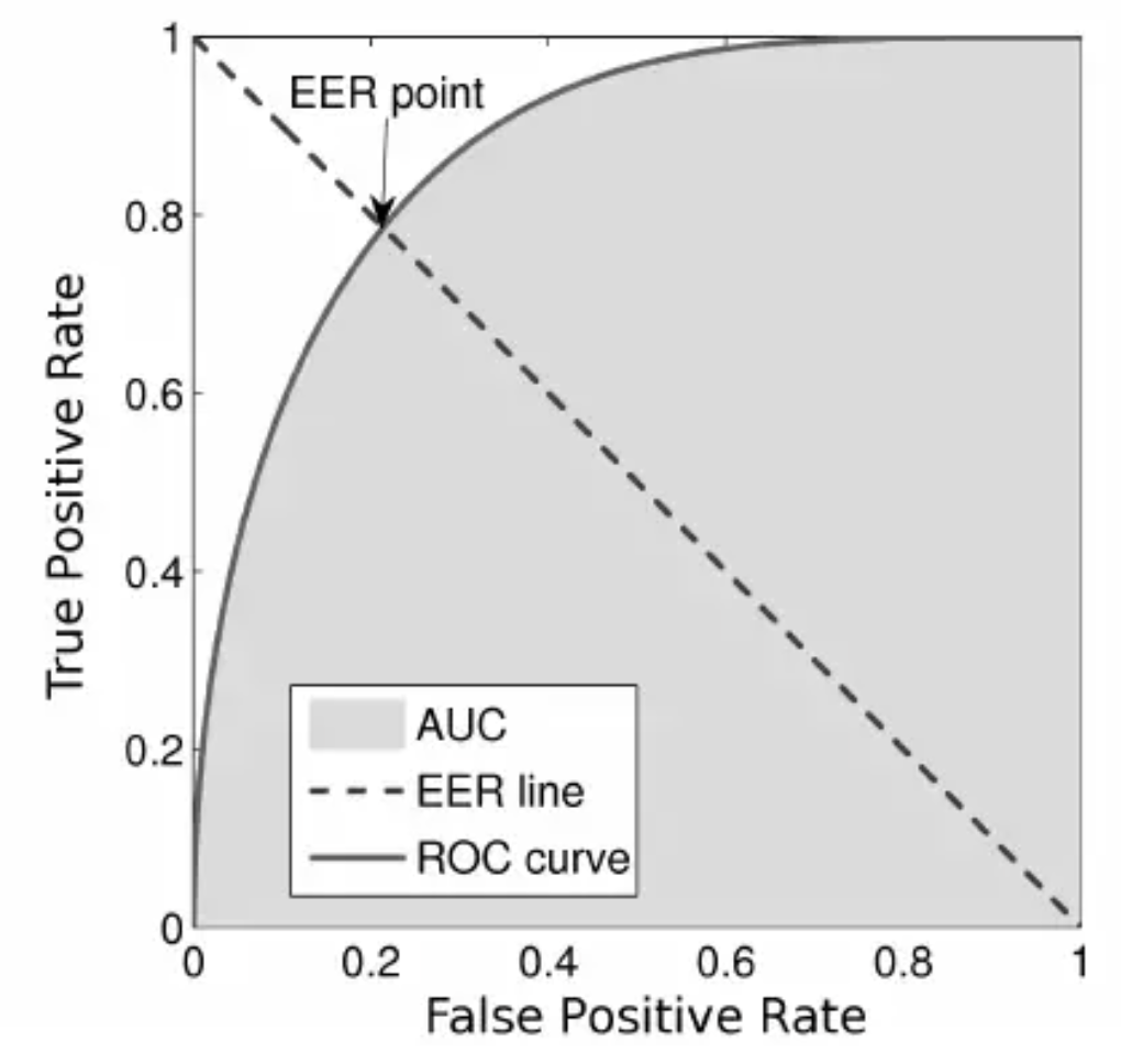
- The equal error rate (EER) in ROC curves is the intersection of the \(y + x = 1\) line with the DET curve (figure source):
Area under the ROC Curve (AUROC)
- The area under the ROC curve (AUROC) is a good metric for measuring the classifier’s performance. This value is normally between 0.5 (for a bad classifier) and 1.0 (a perfect classifier). The better the classifier, the higher the AUC and the closer the ROC curve will be to the top left corner.
Detection error tradeoff (DET) curve
- A detection error tradeoff (DET) curve is a graphical plot of error rates for binary classification systems, plotting the false rejection rate (FRR) vs. false acceptance rate (FAR) for different probability thresholds.
- The X- and Y-axes are scaled non-linearly by their standard normal deviates (or just by logarithmic transformation), yielding tradeoff curves that are more linear than ROC curves, and use most of the image area to highlight the differences of importance in the critical operating region.
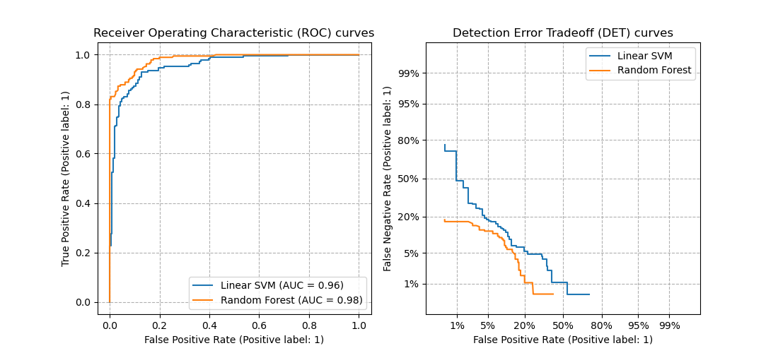
Comparing ROC and DET curves
-
Let’s compare receiver operating characteristic (ROC) and detection error tradeoff (DET) curves for different classification algorithms for the same classification task.
-
DET curves are commonly plotted in normal deviate scale. To achieve this the DET display transforms the error rates as returned by sklearn’s
det_curveand the axis scale usingscipy.stats.norm. -
The point of this example is to demonstrate two properties of DET curves, namely:
-
It might be easier to visually assess the overall performance of different classification algorithms using DET curves over ROC curves. Due to the linear scale used for plotting ROC curves, different classifiers usually only differ in the top left corner of the graph and appear similar for a large part of the plot. On the other hand, because DET curves represent straight lines in normal deviate scale. As such, they tend to be distinguishable as a whole and the area of interest spans a large part of the plot.
-
DET curves give the user direct feedback of the detection error tradeoff to aid in operating point analysis. The user can deduct directly from the DET-curve plot at which rate false-negative error rate will improve when willing to accept an increase in false-positive error rate (or vice-versa).
-
-
The plots below (source) example compare the ROC curve on the left with the corresponding DET curve on the right. There is no particular reason why these classifiers have been chosen for the example plot over other classifiers available in scikit-learn.
- To generate DET curves using scikit-learn:
import numpy as np
from sklearn.metrics import det_curve

y_true = np.array([0, 0, 1, 1])
y_scores = np.array([0.1, 0.4, 0.35, 0.8])

fpr, fnr, thresholds = det_curve(y_true, y_scores)
# fpr: 			array([0.5, 0.5, 0. ])
# fnr: 			array([0. , 0.5, 0.5])
# thresholds: 	array([0.35, 0.4 , 0.8 ])
-
Note the formulae to obtain FAR (FPR) and FRR (FNR):
\[FAR = FPR = \frac{FP}{\text{number of negatives}} = \frac{FP}{FP + TN} \\ FRR = FNR = \frac{FP}{\text{number of positives}} = \frac{FN}{FN + TP}\]- where, FP: False positive; FN: False Negative; TN: True Negative; TP: True Positive
-
Another way to obtain FAR and FRR is through TNR and TPR respectively, as follows:
Equal Error Rate (EER)
- The equal error rate (EER) in DET curves is the intersection of the \(y = x\) line with the DET curve (figure source):

Example Walkthrough with Code
Dataset
- Let’s first generate a 2 class imbalanced dataset
X, y = make_classification(n_samples=10000, n_classes=2, weights=[0.95,0.05], random_state=42)
trainX, testX, trainy, testy = train_test_split(X, y, test_size=0.2, random_state=2)
Train a model for classification
model = LogisticRegression()
model.fit(trainX, trainy)
predictions = model.predict(testX)
Comparing Accuracy vs. Precision-Recall with imbalanced data
accuracy = accuracy_score(testy, predictions)
print('Accuracy: %.3f' % accuracy)
- which outputs:
Accuracy: 0.957
print(classification_report(testy, predictions))
-
which outputs:
         precision    recall  f1-score   support
            0       0.96      0.99      0.98      1884
            1       0.73      0.41      0.53       116
  avg / total       0.95      0.96      0.95      2000
ROC Curve vs. Precision-Recall Curve with imbalanced data
probs = model.predict_proba(testX)
probs = probs[:, 1]
fpr, tpr, thresholds = roc_curve(testy, probs)
pyplot.plot([0, 1], [0, 1], linestyle='--')
pyplot.plot(fpr, tpr, marker='.')
pyplot.show()
auc_score = roc_auc_score(testy, probs)
print('AUC: %.3f' % auc_score)

-
which outputs:
AUC: 0.920
Precision-Recall curve
precision, recall, thresholds = precision_recall_curve(testy, probs)
auc_score = auc(recall, precision)
pyplot.plot([0, 1], [0.5, 0.5], linestyle='--')
pyplot.plot(recall, precision, marker='.')
pyplot.show()
print('AUC: %.3f' % auc_score)

-
which outputs:
AUC: 0.577
Evaluation Metrics for the Regression Problem
- Regression is a type of machine learning problem which helps in finding the relationship between independent and dependent variable.
- Examples include predicting continuous values such as price, rating, etc.
Mean Absolute Error (MAE)
- MAE is a very simple metric which calculates the absolute difference between actual and predicted values.
- Let’s take an example you have input data and output data and use Linear Regression, which draws a best-fit line. To find the MAE for your model, calculate the difference between the actual value and predicted value which yields the absolute error for the current sample. Repeating this for the entire dataset yields the MAE for the model. In other words, sum all the individual errors and divide them by the total number of observations.
-
Note that our aim is to minimize MAE because this is a loss function.
\[\text { MAE }=\frac{1}{N} \sum|y-\hat{y}|\]- where, \(N\) are the total number of data points, \(y\) is the actual output, \(\hat{y}\) is the predicted output and \(\|y-\hat{y}\|\) is the absolute value of the residual.
from sklearn.metrics import mean_absolute_error
print("MAE:", mean_absolute_error(y_test, y_pred))
Pros of MAE
- MAE follows the same units as the output variable so it is easy to interpret.
- MAE is robust to outliers.
Cons of MAE
- The graph of MAE is not differentiable so we have to apply various optimizers like gradient descent which can be differentiable.
Mean Squared Error (MSE)
- To overcome the disadvantage of MAE, next metric came as MSE.
- MSE is widely used and differs from MAE just a little bit where MAE utilizes the absolute difference while MSE is based on the squared difference. MSE can thus be obtained by calculating the squared difference between the actual and predicted value.
-
Note that MSE calculates the squared distance between the actual and predicted values because it disregard the sign of the error and focuses on only the magnitude. This has the effect of avoiding the cancellation of similar positive and negative terms.
\[MSE=\frac{1}{n} \sum(y-\widehat{y})^{2}\]- where, \((y-\widehat{y})^{2}\) is the square of the difference between the actual and predicted value.
-
To obtain RMSE, we can use the NumPy square root function over MSE:
  from sklearn.metrics import mean_squared_error
  print("MSE:", mean_squared_error(y_test, y_pred))
Pros of MSE
- The graph of MSE is differentiable, so you can easily use it as a loss function in deep learning.
Cons of MSE
- The value you obtain after calculating MSE is a squared unit of the output. For example, if the output units are meters, then the MSE is in meter-squared. This makes interpretation of the loss value difficult.
- The higher the error, more the loss. As such, if you have outliers in the dataset, MSE penalizes the outliers the most since the calculated MSE is larger.
Root Mean Squared Error (RMSE)
- As the name suggests, RMSE is the square root of MSE. RMSE is probably the most common evaluation metric when working with deep learning techniques.
import numpy as np
print("RMSE:", np.sqrt(mean_squared_error(y_test, y_pred)))
Pros of RMSE
- The RMSE uses the same units as the output variable which makes interpretation of loss easy.
Cons of RMSE
- Not that robust to outliers compared to MAE.
Root Mean Squared Log Error (RMSLE)
- Taking the log of the RMSE metric slows down the scale of error. The metric is very helpful when you are developing a generative model that is calling the inputs. In that case, the output will vary on a large scale.
- To obtain RMSLE, we can use the NumPy log function over RMSE:
print("RMSE",np.log(np.sqrt(mean_squared_error(y_test,y_pred))))
R-Squared
- The R-squared (\(R^2\)) score is a metric that measures performance by comparing your model with a baseline model.
- \(R^2\) calculates the difference between a regression line and a mean line.
-
\(R^2\) is also known as “coefficient of determination” or sometimes also known as goodness of fit.
\[R^2 = 1-\frac{SS_r}{SS_m}\]- where, \(SS_r\) = squared sum error of the regression line; \(SS_m\) is the squared sum error of the mean line.
from sklearn.metrics import r2_score
r2 = r2_score(y_test,y_pred)
print(r2)
- The most common interpretation of \(R^2\) is how well the regression model fits the observed data. For example, an \(R^2\) of 60% reveals that 60% of the data fits the regression model. Generally, a higher \(R^2\) indicates a better fit for the model.
- However, it is not always the case that a high \(R^2\) is good for the regression model. The quality of the statistical measure depends on many factors, such as the nature of the variables employed in the model, the units of measure of the variables, and the applied data transformation. Thus, sometimes, a high \(R^2\) can indicate the problems with the regression model.
- A low \(R^2\) figure is generally a bad sign for predictive models. However, in some cases, a good model may show a small value.
Adjusted R-Squared
- The disadvantage of the \(R^2\) score is that when adding new features to the data, the \(R^2\) score either increases or remains constant, but it never decreases because it assumes that adding more data causes the variance of data to increase.
- But the problem is when we add an irrelevant feature in the dataset, \(R^2\) sometimes starts increasing, which is incorrect.
-
The Adjusted R Squared metric fixes this problem.
\[\mathrm{R}_{\mathrm{a}}^{2}=1-\left[\left(\frac{\mathrm{n}-1}{\mathrm{n}-\mathrm{k}-1}\right) \times\left(1-\mathrm{R}^{2}\right)\right]\]- where \(n\) is the number of observations; \(k\) is the number of independent variables; \(R_a^2\) = adjusted \(R^2\).
n=40 k=2 adj_r2_score = 1 - ((1-r2)*(n-1)/(n-k-1)) print(adj_r2_score) - As \(k\) increases by adding some features, the denominator will decrease, \(n-1\) will remain constant. \(R^2\) score will remain constant or will increase slightly so the complete answer will increase. When we subtract this from one then the resultant score will decrease – which is what we want when adding irrelevant features to the dataset.
- If we add a relevant feature then the \(R^2\) score will increase and \((1-R^2)\) will decrease heavily and the denominator will also decrease so the complete term decreases, and on subtracting from one the score increases.
Object Detection: IoU, AP, and mAP
- In object detection, two primary metrics are used: intersection over union (IoU) and mean average precision (mAP). Let’s walk through a small example.
Intersection over Union (IoU)
- Object detection involves finding objects, classifying them, and localizing them by drawing bounding boxes around them. IoU is an intuitive metric that measures the goodness of fit of a bounding box (figure credit to J. Hui’s excellent post):
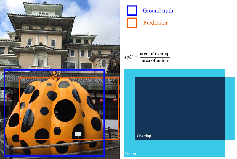
- The higher the IoU, the better the fit. IoU is a great metric since it works well for any size and shape of object. This per-object metric, along with precision and recall, form the basis for the full object detection metric, mean average precision (mAP).
Average Precision (AP): Area Under the Curve (AUC)
-
Object detectors create multiple predictions: each image can have multiple predicted objects, and there are many images to run inference on. Each predicted object has a confidence assigned with it: this is how confident the detector is in its prediction.
-
We can choose different confidence thresholds to use, to decide which predictions to accept from the detector. For instance, if we set the threshold to 0.7, then any predictions with confidence greater than 0.7 are accepted, and the low confidence predictions are discarded. Since there are so many different thresholds to choose, how do we summarize the performance of the detector?
-
The answer uses a precision-recall curve. At each confidence threshold, we measure the precision and recall of the detector, giving us one data point. If we connect these points together, one for each threshold, we get a precision recall curve like the following (figure source):
- The better the model, higher the precision and recall at its points: this pushes the boundary of the curve (the dark line) towards the top and right. We can summarize the performance of the model with one metric, by taking the area under the curve (shown in blue). This gives us a number between 0 and 1, where higher is better. This metric is commonly known as average precision (AP).
Mean Average Precision (mAP)
-
Object detection is a complex task: we want to accurately detect all the objects in an image, draw accurate bounding boxes around each one, and accurately predict each object’s class. We can actually encapsulate all of this into one metric: mean average precision (mAP).
-
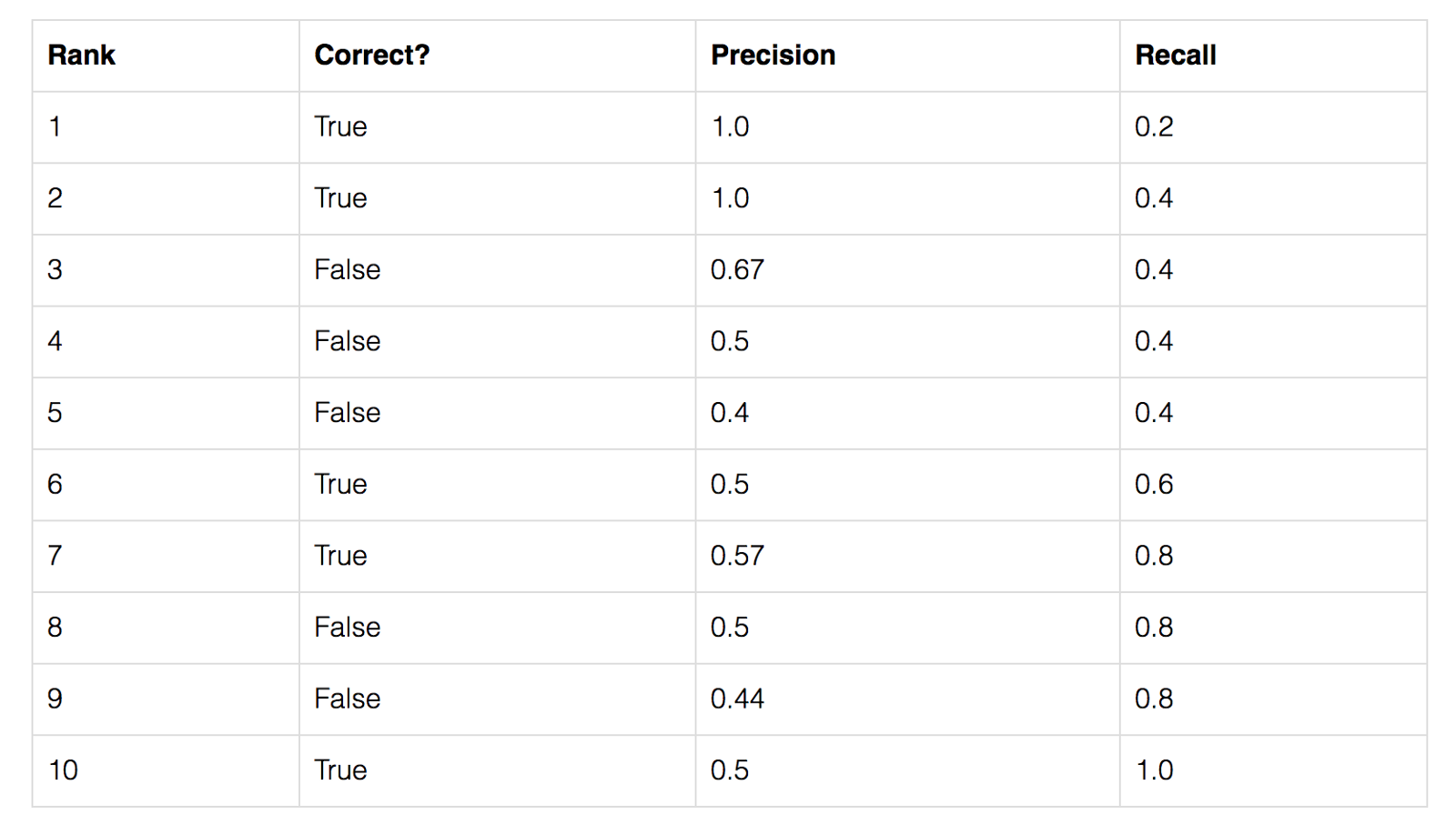
To start, let’s compute AP for a single image and class. Imagine our network predicts 10 objects of some class in an image: each prediction is a single bounding box, predicted class, and predicted confidence (how confident the network is in its prediction).
-
We start with IoU to decide if each prediction is correct or not. For a ground truth object and nearby prediction, if,
- the predicted class matches the actual class, and
- the IoU is greater than a threshold,
- … we say that the network got that prediction right (true positive). Otherwise, the prediction is a false positive.
-
We can now sort our predictions by their confidence, descending, resulting in the following table. Table of predictions, from most confident to least confident. Cumulative recision and recall shown on the right:
- For each confidence level (starting from largest to smallest), we compute the precision and recall up to that point. If we graph this, we get the raw precision-recall curve (figure source) for this image and class:
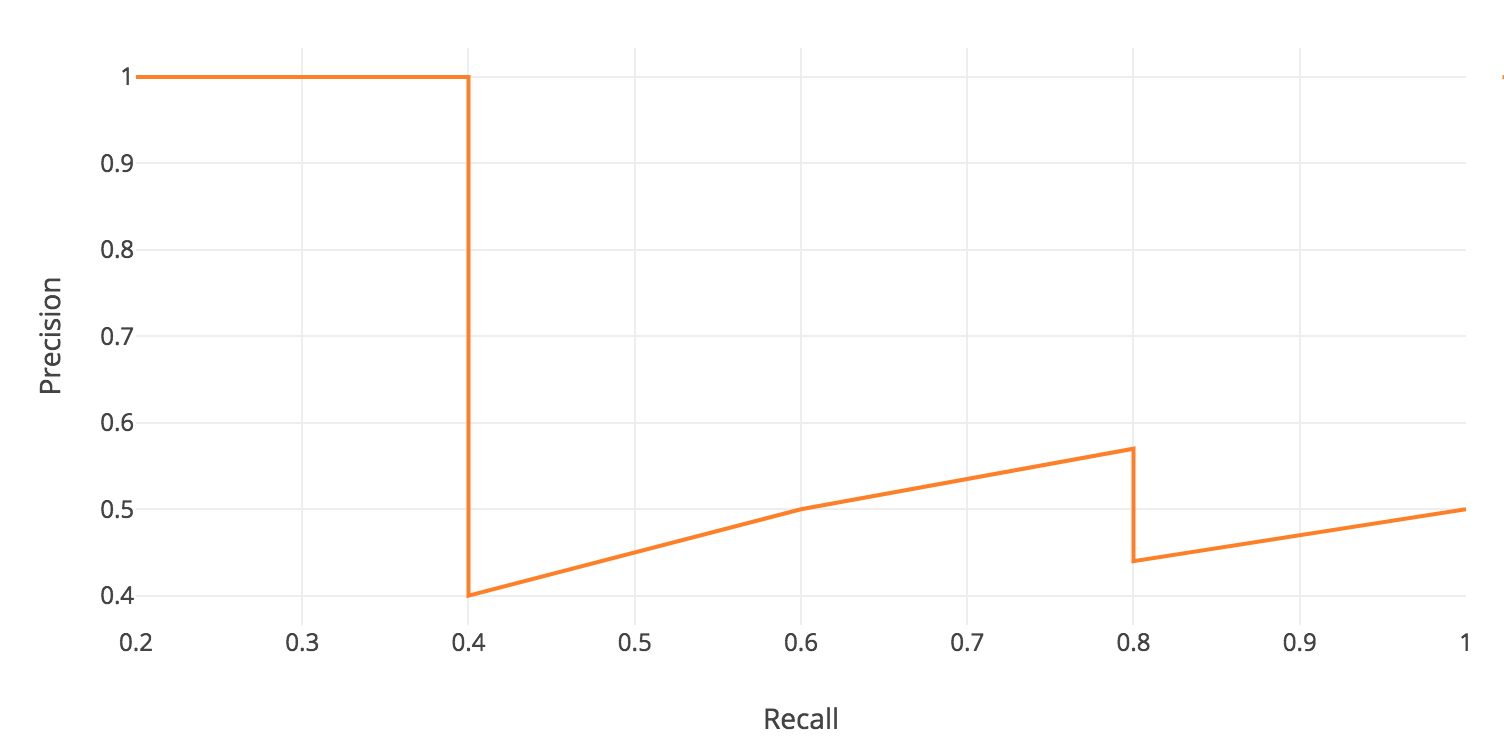
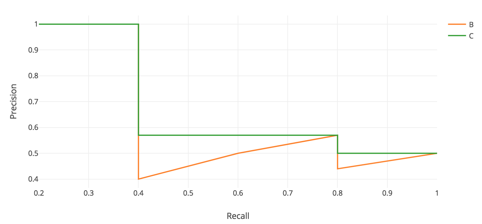
- Notice how our precision-recall curve is jagged: this is due to some predictions being correct (increasing recall) and others being incorrect (decreasing precision). We smooth out the kinks in this graph to produce our network’s final PR curve for this image and class. The smoothed precision-recall curve (figure source) used to calculate average precision (area under the curve):
-
The average precision (AP) for this image and class is the area under this smoothed curve.
-
To compute the mean average precision over the whole dataset, we average the AP for each image and class, giving us one single metric of our network’s performance on classification! This is the metric that is used for common object detection benchmarks such as Pascal VOC and COCO.
Evaluation Metrics for Generative Text Models
Overview
- Classification
- Classification metrics typically include accuracy, precision, recall, F1-score, and AUC-ROC, which help in evaluating the performance of a model in distinguishing between different classes.
- Please refer to the section on Evaluation Metrics for the Classification Problem.
- Language Modeling
- Perplexity: Perplexity is a measure of how well a probabilistic model predicts a sample. Lower perplexity indicates a better predictive model. It is commonly used in evaluating language models in natural language processing.
- Burstiness: Burstiness measures the phenomenon where certain terms appear in bursts rather than being evenly distributed over time. It can indicate how certain topics or keywords fluctuate in frequency, which is relevant for temporal text analysis and anomaly detection.
- Please refer to the section on Evaluation Metrics for the Classification Problem.
- Machine Translation and Image Captioning
- Lexical/Keyword-based Metrics
- BLEU (BiLingual Evaluation Understudy): BLEU is a metric for evaluating the quality of text which has been machine-translated from one language to another. It compares the machine’s output to that of a human by counting matching n-grams.
- METEOR (Metric for Evaluation of Translation with Explicit ORdering): METEOR evaluates translations by considering synonymy, stemming, and word order. It often correlates better with human judgment than BLEU.
- CIDEr (Consensus-based Image Description Evaluation): CIDEr measures the similarity of a generated image description to human descriptions. It takes into account the consensus of multiple human annotations and is particularly used in image captioning tasks.
- Semantic Metrics
- BERTScore: BERTScore evaluates text generation by comparing the contextual embeddings from BERT for each token in the candidate and reference texts. It captures semantic similarity more effectively than surface-level metrics.
- MoverScore: MoverScore evaluates text generation by measuring the semantic distance between the candidate and reference texts. It uses word embeddings to capture the meaning of the texts and computes the similarity based on the distance moved in the embedding space.
- Lexical/Keyword-based Metrics
- Text Summarization
- ROUGE (Recall-Oriented Understudy for Gisting Evaluation): ROUGE evaluates the quality of summaries by comparing them to reference summaries. It measures the overlap of n-grams, word sequences, and word pairs between the computer-generated summary and the reference.
- Manual evaluation by humans for text generation (say fluency, grammar, etc.), image generation (say realism based on generated details), recommendation systems (comparative ranking), etc.
- Mean Opinion Score (MOS): MOS is a measure used to evaluate the quality of human experiences in services like telephony and multimedia. It aggregates human judgments on various criteria into a single score, typically on a scale from 1 to 5.
- NLP Benchmark Suites
- GLUE (General Language Understanding Evaluation): GLUE is a benchmark for evaluating the performance of models across a diverse range of natural language understanding tasks. It includes tasks such as question answering, sentiment analysis, and textual entailment.
- SuperGLUE (Super General Language Understanding Evaluation): SuperGLUE is an extension of GLUE designed to provide a more challenging benchmark for advanced NLP models. It includes more complex tasks and requires deeper language understanding and reasoning.
Perplexity
Background
- Perplexity (PPL) is the measure of how predictable the text is. It is one of the most common metrics for evaluating the performance of language models. It refers to how well the model is able to predict the next word in a sequence of words. LLMs generate text procedurally, i.e., word-by-word. LLMs selects the next probable word in a sentence from a \(K\)-number of weighted options in the sample.
- Perplexity is based on the concept of entropy, which is the amount of chaos or randomness in a system. In the context of language modeling, it’s a way to quantify the performance of the model: a lower perplexity score indicates that the language model is better at calculating the next word that is likely to occur in a given sequence, while a higher perplexity score indicates that the model is less accurate. Basically, the lower the perplexity, the better the model is at predicting the next sample from the distribution. This indicates better generalization and performance.
Definition
- Wikipedia defines perplexity as: “a measurement of how well a probability distribution or probability model predicts a sample.”
- Intuitively, perplexity can be understood as a measure of uncertainty. The perplexity of a language model can be seen as the level of perplexity when predicting the following symbol. Consider a language model with an entropy of three bits, in which each bit encodes two possible outcomes of equal probability. This means that when predicting the next symbol, that language model has to choose among possible options. Thus, we can infer that this language model has a perplexity of 8.
-
Entropy is a measure of the unpredictability or randomness of a random variable. For a discrete random variable \(X\) with probability distribution \(p(x)\), the entropy \(H(X)\) is defined as:
\[H(X)=-\sum_x p(x) \log _2 p(x)\]- where the sum is over all possible values of \(X\).
-
Perplexity can also be defined as the exponent of the negative log-probability. Specifically, perplexity is the exponentiated average negative log-likelihood of a sequence. Mathematically, the perplexity of a language model, based on entropy, is defined as:
\[\operatorname{PPL}(X)=2^{\mathrm{H}(X)}\]-
where \(H\) is the entropy.
-
Thus,
\[PPL(X)=2^{-\frac{1}{N} \sum_{x \in X} \log _2 p(x)}\]- where \(N\) is the size of the test set.
-
When dealing with language models, it’s common to work with the conditional probability of words given the preceding words, so the perplexity for a sequence of words \(w_1, w_2, \ldots, w_N\) would be:
- Assuming the words are independent (which is a simplification, but works for the sake of explanation), this can be broken down into:
- In simpler terms:
- If a model has a perplexity of 1, it means the model predicts the test samples perfectly with certainty.
- A higher perplexity suggests that the model has more uncertainty in its predictions.
- For example, if a language model has a perplexity of 10 for English, it means that, on average, every time the model tries to predict the next word, it’s as uncertain as if it were randomly guessing among 10 words.
-
- It’s worth noting that the absolute value of perplexity might not be as meaningful as comparing perplexities between models on the same dataset. A lower perplexity indicates a better model, but the actual value is contingent on the specific test set and the complexity of the language/task being modeled.
Example
- As an example, let’s consider this sentence and try to predict the next token:
“I picked up the kids and dropped them off at …”
- A language model with high perplexity might propose “icicle”, “pensive”, or “luminous” as answers. Those words don’t make sense; it’s word salad. Somewhere in the middle might be “the President’s birthday party”. It’s highly unlikely but could be plausible, on rare occasions. But a language model with low perplexity might answer “school” or “the pool”. That’s an accurate, correct prediction of what likely comes next.
- As you can see, there are varying degrees of plausibility in the output.
- Perplexity is commonly used in NLP tasks such as speech recognition, machine translation, and text generation, where the most predictable option is usually the correct answer.
- For writing generic content that’s intended to be standard or ordinary, lower perplexity is the safest bet. Lower the perplexity, the less random the text. Large language models learn to maximize the text probability, which means minimizing the negative log-probability, which in turn means minimizing the perplexity. Lower perplexity is thus desired.
- For more: Perplexity of fixed-length models.
Summary
- What is Perplexity?
- Perplexity is a measure commonly used in natural language processing and information theory to assess how well a probability distribution predicts a sample. In the context of language models, it evaluates the uncertainty of a model in predicting the next word in a sequence.
- ** Why use Perplexity?**
- Perplexity serves as an inverse probability metric. A lower perplexity indicates that the model’s predictions are closer to the actual outcomes, meaning the model is more confident (and usually more accurate) in its predictions.
- How is it calculated?
- For a probability distribution \(p\) and a sequence of \(N\) words \(w_1, w_2, ... w_N\):
- In simpler terms, if we only consider bigrams (two-word sequences) and a model assigns a probability \(p\) to the correct next word, the perplexity would be \(\frac{1}{p}\).
- Where to use?
- Language Models: To evaluate the quality of language models. A model with lower perplexity is generally considered better.
- Model Comparison: To compare different models or different versions of the same model over a dataset.
Burstiness
- Burstiness implies that if a term is used once in a document, then it is likely to be used again. This phenomenon is called burstiness, and it implies that the second and later appearances of a word are less significant than the first appearance.
- Importantly, the burstiness of a word and its semantic content are positively correlated; words that are more informative are also more bursty.
- Burstiness basically measures how predictable a piece of content is by the homogeneity of the length and structure of sentences throughout the text. In some ways, burstiness is to sentences what perplexity is to words.
- Whereas perplexity is the randomness or complexity of the word usage, burstiness is the variance of the sentences: their lengths, structures, and tempos. Real people tend to write in bursts and lulls – we naturally switch things up and write long sentences or short ones; we might get interested in a topic and run on, propelled by our own verbal momentum.
- AI is more robotic: uniform and regular. It has a steady tempo, compared to our creative spontaneity. Humans get carried away and improvise; that’s what captures the reader’s attention and encourages them to keep reading.
- Burstiness \(b\) is mathematically calculated as: \(b = (\frac{\sigma_{\tau}/m_{\tau} - 1}{\sigma_{\tau}/m_{\tau} + 1})\) and is bounded within the interval \([-1, 1]\). Therefore the hypothesis is \(b_H - b_{AI} \geq 0\), where \(b_H\) is the mean burstiness of human writers and $b_{AI}$ is the mean burstiness of the model. Corpora with anti-bursty, periodic dispersions of switch points take on burstiness values closer to -1 (usually ones that originate from AI). In contrast, corpora with less predictable patterns of switching take on values closer to 1 (usually ones that originate from humans).
Summary
- What is Burstiness?
- Burstiness refers to the occurrence of unusually frequent repetitions of certain terms in a text. It’s the idea that once a word appears, it’s likely to appear again in short succession.
- Why consider Burstiness?
- Burstiness can indicate certain patterns or biases in text generation. For instance, if an AI language model tends to repeat certain words or phrases too often in its output, it may suggest an over-reliance on certain patterns or a lack of diverse responses.
- How is it measured?
- While there isn’t a single standard way to measure burstiness, one common method involves looking at the distribution of terms and identifying terms that appear more frequently than a typical random distribution would suggest.
- Where to use?
- Text Analysis: To understand patterns in text, e.g., to see if certain terms are being repeated unusually often.
- Evaluating Generative Models: If a language model produces text with high burstiness, it might be overfitting to certain patterns in the training data or lacking diversity in its outputs.
- In Context of AI and Recommender Systems, both perplexity and burstiness can provide insights into the behavior of AI models, especially generative ones like LLMs.
- Perplexity can tell us how well the model predicts or understands a given dataset.
- Burstiness can inform us about the diversity and variability of the model’s outputs. - In recommender systems, if the system is generating textual recommendations or descriptions, perplexity can help assess the quality of those recommendations. Burstiness might indicate if the system keeps recommending the same/similar items repetitively.
BLEU
- BLEU, an acronym for Bilingual Evaluation Understudy was proposed in BLUE: a Method for Automatic Evaluation of Machine Translation and is predominantly used in machine translation. It quantifies the quality of the machine-generated text by comparing it with a set of reference translations. The crux of the BLEU score calculation is the precision of n-grams (continuous sequence of n words in the given sample of text) in the machine-translated text. However, to prevent the overestimation of precision due to shorter sentences, BLEU includes a brevity penalty factor. Despite its widespread use, it’s important to note that BLEU mainly focuses on precision, and lacks a recall component.
When evaluating machine translation, multiple characteristics are taken into account:
- adequacy
- fidelity
- fluency
- Mathematically, precision for unigram (single word) is calculated as follows:
- BLEU extends this idea to consider precision of n-grams. However, BLEU uses a modified precision calculation to avoid the problem of artificially inflated precision scores.
-
The equation of BLEU score for n-grams is:
\[BLEU = BP * exp (\sum_{i=1}^n w_i * log (p_i))\]- where,
- \(BP\) is the brevity penalty (to penalize short sentences).
- \(w_i\) are the weights for each gram (usually, we give equal weight).
- \(p_i\) is the precision for each i-gram.
- where,
- In its simplest form, BLEU is the quotient of the matching words under the total count of words in hypothesis sentence (transduction). Referring to the denominator, we can see that BLEU is a precision oriented metric.
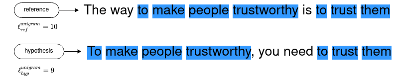
- For example, the matches in the sample sentences are “to”, “make”, “people”, “trustworthy”, “to”, “trust”, “them”
Unigram matches tend to measure adequacy while longer n-grams matches account for fluency.
- As the next step, the calculated precision values for various n-grams are aggregated using a weighted average of the logarithm of precisions.
-
To counter the disadvantages of precision metric, a brevity penalty is added. Penalty is none, i.e. 1.0, when the hypothesis sentence length is the same as the reference sentence length.
-
The brevity penalty \(BP\) is function of the lengths of reference and hypothesis sentences.
- BLEU score is a scalar value in range between 0 and 1. A score of 0.6 or 0.7 is considered the best you can achieve. Even two humans would likely come up with different sentence variants for a problem, and would rarely achieve a perfect match.
Example
| Type | Sentence | Length |
|---|---|---|
| Reference (by human) | The way to make people trustworthy is to trust them. | $$\ell_{ref}^{unigram} = 10$$ |
| Hypothesis/Candidate (by machine) | To make people trustworthy, you need to trust them. | $$\ell_{hyp}^{unigram} = 9$$ |
- For this example we take parameters as the base line score, described in the paper, with \(N = 4\), and a uniform distribution, therefore taking \(w_n = { 1 \over 4 }\).
- We then calculate the precision \(p_n\) for the different n-grams. For instance, here is an illustration of the bigram (2-gram) matches:
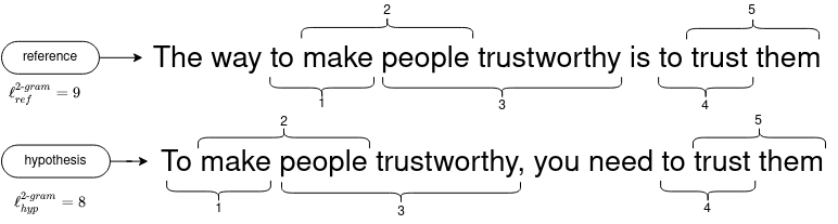
- The following table details the precision values for \([1, 4]\) n-grams.
| n-gram | 1-gram | 2-gram | 3-gram | 4-gram |
|---|---|---|---|---|
| $$p_n$$ | $${ 7 \over 9 }$$ | $${ 5 \over 8 }$$ | $${ 3 \over 7 }$$ | $${ 1 \over 6 }$$ |
- We then calculate the brevity penalty:
- Finally, we aggregate the precision values across all n-grams, which gives:
BLEU with python and sacreBLEU package
- BLEU computation is made easy with the
sacreBLEUpython package.
For simplicity, the sentences are pre-normalized, removing punctuation and case folding.
from sacrebleu.metrics import BLEU
bleu_scorer = BLEU()

hypothesis = "to make people trustworthy you need to trust them"
reference = "the way to make people trustworthy is to trust them"

score = bleu_scorer.sentence_score(
    hypothesis=hypothesis,
    references=[reference],
)

score.score/100 # sacreBLEU gives the score in percent
ROUGE
- ROUGE score stands for Recall-Oriented Understudy for Gisting Evaluation. It was proposed in ROUGE: A Package for Automatic Evaluation of Summaries and is used primarily for evaluating automatic summarization and, sometimes, machine translation.
- The key feature of ROUGE is its focus on recall, measuring how many of the reference n-grams are found in the system-generated summary. This makes it especially useful for tasks where coverage of key points is important. Among its variants, ROUGE-N computes the overlap of n-grams, ROUGE-L uses the longest common subsequence to account for sentence-level structure similarity, and ROUGE-S includes skip-bigram statistics.
- ROUGE-N specifically refers to the overlap of N-grams between the system and reference summaries.
- ROUGE-L considers sentence level structure similarity naturally and identifies longest co-occurring in-sequence n-grams automatically.
- ROUGE-S includes skip-bigram plus unigram-based co-occurrence statistics. Skip-bigram is any pair of words in their sentence order.
- In its simplest form ROUGE score is the quotient of the matching words under the total count of words in reference sentence (summarization). Referring to the denominator, we can see that ROUGE is a recall oriented metric.
Example
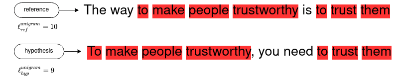
- ROUGE-1 is the ROUGE-N metric applied with unigrams.
| Type | Sentence | Length |
|---|---|---|
| Reference (by human) | The way to make people trustworthy is to trust them. | $$\ell_{ref}^{unigram} = 10$$ |
| Hypothesis/Candidate (by machine) | To make people trustworthy, you need to trust them. | $$\ell_{hyp}^{unigram} = 9$$ |
- The following illustrates the computation of ROUGE-1 on the summarization sentences:
- Four ROUGE metrics are defined is the original paper: ROUGE-N, ROUGE-L, ROUGE-W, and ROUGE-S. Here, we focus on the ROUGE-L score.
- ROUGE score is computed as a scalar value in the range \([0,1]\). A ROUGE score close to zero indicates poor similarity between candidate and references. A ROUGE score close to one indicates strong similarity between candidate and references .
ROUGE-L
-
ROUGE-L or \(ROUGE_{LCS}\) is based on the length of the longest common subsequence (LCS). To counter the disadvantages of a pure recall metric as in ROUGE-N, ROUGE-L calculates the \(F_{\beta}\)-score (i.e., weighted harmonic mean with \(\beta\) being the weight), combining the precision score and the recall score.
-
The advantages of \(ROUGE_{LCS}\) is that it does not simply seek contiguous lexical overlap over n-grams but in-sequence matches (i.e., the overlapping words may not necessarily appear in the same order). The other (bigger) advantage is that it automatically includes longest in-sequence common n-grams, therefore no predefined n-gram length is necessary.
Example
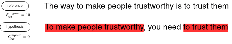
- To give recall and precision equal weights, we take \(\beta=1\):
ROUGE with python and Rouge package
- ROUGE computation is made easy with the
Rougepython package.
For simplicity, sentences are pre-normalized, removing punctuation and case folding
from rouge import Rouge
rouge_scorer = Rouge()

hypothesis = "to make people trustworthy you need to trust them"
reference = "the way to make people trustworthy is to trust them"

score = rouge_scorer.get_scores(
    hyps=hypothesis,
    refs=reference,
)
score[0]["rouge-l"]["f"]
BLEU vs. ROGUE
- BLEU score was first created to automatically evaluate machine translation while ROGUE was created a little later to score the task of auto-summarization.
- Both metrics are calculated using n-gram co-occurrence statistics (i.e., n-gram lexical overlap) and they both range from \([0, 1]\), with 0 indicating full dissimilarity and 1 meaning the sentences are exactly the same.
- Despite their relative simplicity, BLEU and ROUGE similarity metrics are quite reliable since they were proven to highly correlate with human judgements.
- The following image (source) shows a side-by-side comparison of BLEU vs. ROGUE:
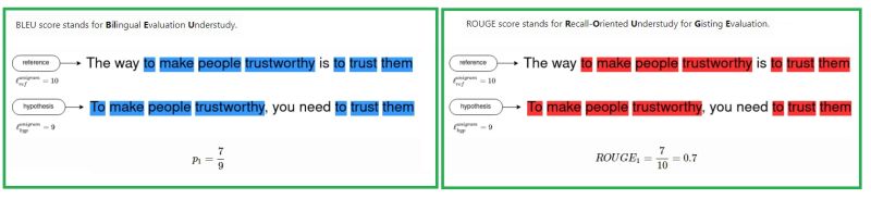
Goal
- Given two sentences, one written by human (reference/gold standard), and a second one generated by a computer (hypothesis/candidate), automatically evaluating the similarity between them is the goal behind these metrics.
- BLEU and ROUGE try to answer this in two different contexts. BLEU for translation between two languages and ROUGE for automatic summarization.
- Here is an example of two similar sentences. We’ll use them in the following to illustrate the calculation of both metrics.
| Type | Sentence |
|---|---|
| Reference (by human) | The way to make people trustworthy is to trust them. |
| Hypothesis/Candidate (by machine) | To make people trustworthy, you need to trust them. |
Summary
Similarities
- A short summary of the similitudes of the two scoring methods:
- Inexpensive automatic evaluation.
- Count the number of overlapping units such as n-gram, word sequences, and word pairs between hypothesis and references.
- The more reference sentences the better.
- Correlates highly with human evaluation.
- Rely on tokenization and word filtering, text normalization.
- Does not cater for different words that have the same meaning — as it measures syntactical matches rather than semantics.
Differences
| BLEU score | ROUGE score |
|---|---|
| Initially made for translation evaluations (BiLingual Evaluation Understudy) | Precision oriented score |
| Initially made for summary evaluations (Recall-Oriented Understudy for Gisting Evaluation) | Recall oriented score (considering the ROUGE-N version -- and not the ROUGE-L version) |
| One variant (BLUE-N) | Multiple versions (ROUGE-N and ROUGE-L) |
BERTScore
- BERTScore is an evaluation metric used to assess the quality of text generation tasks, such as machine translation, summarization, and text generation, by leveraging contextual embeddings from transformer-based models like BERT. It aims to provide a more nuanced and semantically aware evaluation compared to traditional metrics like BLEU or ROUGE.
Key Features of BERTScore
- Contextual Embeddings:
- BERTScore utilizes contextual embeddings from pre-trained transformer models (e.g., BERT, RoBERTa, or XLM-R). These embeddings capture the meaning of words in their specific context, providing a deeper understanding of the text compared to static word embeddings.
- Token-Level Similarity:
- Instead of relying on n-gram overlaps, BERTScore computes similarity scores at the token level. Each token in the candidate sentence is compared to tokens in the reference sentence using their embeddings.
- Precision, Recall, F1-Score:
- BERTScore calculates three metrics:
- Precision: Measures how many tokens in the candidate sentence are similar to tokens in the reference sentence.
- Recall: Measures how many tokens in the reference sentence are captured by the candidate sentence.
- F1-Score: The harmonic mean of precision and recall, providing a balanced measure of both.
- BERTScore calculates three metrics:
How BERTScore Works
- Tokenization and Embedding Extraction:
- Both the reference and candidate sentences are tokenized, and embeddings for each token are extracted using a pre-trained transformer model.
- Cosine Similarity Calculation:
- The cosine similarity between each token in the candidate sentence and each token in the reference sentence is computed. This similarity reflects how close the meanings of the tokens are in the embedding space.
- Optimal Matching:
- For each token in the candidate sentence, the highest cosine similarity score to any token in the reference sentence is selected, and vice versa. These scores are used to calculate precision, recall, and F1-score.
- Aggregation:
- The precision, recall, and F1-scores are aggregated over the entire dataset to provide an overall evaluation of the model’s performance.
Advantages of BERTScore
- Contextual Understanding:
- By using contextual embeddings, BERTScore captures the meaning of words in their specific context, making it more sensitive to nuances in language compared to traditional metrics.
- Handling Synonyms and Paraphrasing:
- BERTScore is robust to variations in word choice and sentence structure, as it measures the semantic similarity between tokens. This makes it effective in handling synonyms and paraphrases.
- Balanced Evaluation:
- By providing precision, recall, and F1-scores, BERTScore offers a comprehensive evaluation, balancing different aspects of text generation quality.
Use Cases
- BERTScore is particularly useful for evaluating:
- Machine Translation: Assessing how well a translated sentence captures the meaning of the original sentence.
- Text Summarization: Evaluating the quality and relevance of generated summaries.
- Text Generation: Measuring the coherence and relevance of generated content in applications like chatbots and content creation.
Summary
- BERTScore is a sophisticated evaluation metric that leverages the power of transformer-based models to provide a deep, contextual understanding of text. It moves beyond simple n-gram overlaps to measure the semantic similarity between sentences, offering a more nuanced and accurate assessment of text generation quality.
MoverScore
- MoverScore is an evaluation metric for assessing the quality of text generation, particularly useful in natural language processing (NLP) tasks like machine translation, summarization, and text generation. It is designed to measure the semantic similarity between a reference sentence and a candidate sentence.
Key Features of MoverScore
- Word Mover’s Distance (WMD):
- MoverScore is based on the Word Mover’s Distance, which calculates the minimum amount of “work” (or distance) required to transform one sentence into another by moving word embeddings.
- This distance metric measures how much one sentence needs to “move” its words to match the words in another sentence, using pre-trained word embeddings to represent the words.
- Embedding-Based Similarity:
- It utilizes pre-trained word embeddings from models like BERT to capture the semantic meaning of words.
- By using these embeddings, MoverScore is able to account for the semantic similarity between words, even if they are not exact matches (e.g., synonyms).
- Semantic Matching:
- MoverScore focuses on the overall semantic content of sentences rather than just surface-level word matching.
- This makes it more robust to variations in word choice and sentence structure, providing a more meaningful assessment of text quality.
How MoverScore Works
- Embedding Extraction:
- First, the reference and candidate sentences are tokenized, and embeddings for each word/token are extracted using a pre-trained language model like BERT.
- Distance Calculation:
- The Word Mover’s Distance is computed between the reference and candidate sentences. This involves calculating the minimum cumulative distance that the word embeddings from the reference sentence need to travel to align with the word embeddings from the candidate sentence.
- Score Computation:
- The final MoverScore is derived from the computed distances, reflecting how semantically close the candidate sentence is to the reference sentence.
Advantages of MoverScore
- Semantic Understanding: By leveraging word embeddings, MoverScore captures the semantic meaning of sentences, making it sensitive to the overall content and meaning rather than just exact word matches.
- Robustness to Synonyms and Paraphrasing: Since it measures distances between word embeddings, MoverScore can effectively handle synonyms and paraphrases, recognizing that different words can have similar meanings.
- Holistic Evaluation: It provides a sentence-level evaluation, considering the overall semantic similarity rather than just individual token or n-gram overlaps.
Use Cases
- MoverScore is particularly useful in applications where the semantic content and meaning of the text are crucial, such as:
- Machine Translation: Evaluating how well a translated sentence retains the meaning of the original sentence.
- Summarization: Assessing the quality of generated summaries by comparing them to reference summaries.
- Text Generation: Measuring the coherence and relevance of generated text in tasks like dialogue systems or content creation.
- In summary, MoverScore offers a sophisticated method for evaluating the semantic similarity between texts by utilizing word embeddings and the Word Mover’s Distance, providing a nuanced assessment of text quality beyond surface-level word matching.
Comparative Analysis: BERTScore vs. MoverScore
- BERTScore and MoverScore are both evaluation metrics used to assess the quality of text generation, particularly in natural language processing tasks like machine translation, summarization, and text generation. However, they have different approaches and offer distinct advantages.
MoverScore
- Approach:
- Word Mover’s Distance (WMD): MoverScore leverages the Word Mover’s Distance, which measures the minimum distance that words from the reference sentence need to travel to match words in the candidate sentence.
- Embedding-Based: It uses pre-trained word embeddings (e.g., BERT embeddings) to calculate these distances, ensuring that semantically similar words have lower distances.
- Semantic Matching: By focusing on the distance between word embeddings, MoverScore captures semantic similarities more effectively than traditional n-gram overlap metrics.
- Advantages:
- Fine-Grained Semantic Understanding: By measuring the distance between word embeddings, MoverScore captures subtle semantic nuances and relationships between words that might be missed by surface-level metrics.
- Robust to Synonyms: It effectively handles synonyms and paraphrases since semantically similar words have closer embeddings.
- Sentence-Level Evaluation: MoverScore can provide a more holistic assessment of sentence similarity by considering the overall structure and meaning rather than just matching individual words or n-grams.
BERTScore
- Approach:
- Token-Level Similarity: BERTScore computes token-level similarity between reference and candidate sentences using contextual embeddings from BERT (or other transformer models).
- Precision, Recall, F1: It calculates precision, recall, and F1-score based on the cosine similarity of BERT embeddings for each token pair between the reference and candidate sentences.
- Advantages:
- Contextual Embeddings: BERTScore uses contextual embeddings, capturing word meaning in context, which helps in evaluating text generation tasks more accurately.
- Balancing Precision and Recall: By providing precision, recall, and F1-score, BERTScore offers a balanced view of the generated text’s quality.
- Ease of Implementation: BERTScore can be easily implemented using pre-trained BERT models, making it accessible for various NLP tasks.
Summary of Key Differences
- Semantic Matching vs. Token Similarity: MoverScore uses Word Mover’s Distance with pre-trained embeddings to measure overall sentence-level semantic similarity. In contrast, BERTScore focuses on token-level similarity using contextual embeddings.
- Evaluation Focus: MoverScore provides a fine-grained semantic evaluation by measuring the distance between word embeddings, while BERTScore evaluates precision, recall, and F1-score of token embeddings.
-
Robustness to Synonyms: MoverScore is inherently robust to synonyms and paraphrases due to its reliance on embedding distances, whereas BERTScore also handles these well but through contextual embeddings.
- In summary, MoverScore offers a sentence-level semantic similarity measure that captures the overall meaning and structure of sentences, while BERTScore provides a detailed token-level similarity assessment with a focus on precision, recall, and F1-score.
Evaluation Metrics for Generative Image Models
Fréchet Inception Distance
- This metric compares the statistics of the generated samples and real samples. It models both distributions as multivariate Gaussian. Thus, these two distributions can be compactly represented by their mean \(\mu\) and covariance matrix \(\Sigma\) exclusively. That is:
-
These two distributions are estimated with 2048-dimensional activations of the Inception-v3 pool3 layer for real and generated samples respectively.
-
Finally, the FID between the real image distribution (\(Xr\)) and the generated image distribution (\(Xg\)) is computed as:
- Therefore, lower FID corresponds to more similar real and generated samples as measured by the distance between their activation distributions.
Evaluation Metrics for Speech Models
- Wakeword Detection (i.e., Keyword Spotting, Trigger Word Detection)/Speaker Recognition
- Speech Recognition
- Text-to-Speech (TTS)
- Two approaches: (i) subjective evaluation and (ii) objective evaluation.
- For subjective evaluation the most popular evaluation metric is Mean Opinion Score (MOS), but there are other more complicated tests like MUSHRA.
- For objective evaluations the most popular test is the simple Mel Cepstral Distortion (MCD) test, but there are more advanced ones. For more details see Text-to-speech Synthesis by Paul Taylor.
Evaluation Metrics for Generative Speech Models
Fréchet Audio Distance
- Proposed in Fréchet Audio Distance: A Metric for Evaluating Music Enhancement Algorithms, by Kilgour et al. from Google AI, Fréchet Audio Distance (FAD) is a novel evaluation metric for music enhancement algorithms. FAD, inspired by the Fréchet Inception Distance used in image models, provides a reference-free metric that compares statistics of embeddings generated from enhanced music to those from clean music.
- The paper identifies the limitations of traditional signal-based metrics like Signal to Distortion Ratio (SDR), which may not align with human perception of audio quality. FAD, unlike these metrics, does not require a reference signal, making it adaptable for various applications where original clean music or noise signals are unavailable.
- The FAD computation involves using the VGGish model, derived from the VGG image recognition architecture, to generate embeddings from audio. These embeddings are then used to compute the Fréchet distance between multivariate Gaussians estimated from the enhanced and clean music datasets.
- The following figure shows an overview of FAD computation: using a pretrained audio classification model, VGGish, embeddings are extracted from both the output of a enhancement model that we wish to evaluate and a large database of background music. The Fréchet distance is then computed between multivariate Gaussians estimated on these embeddings.
- To validate FAD’s effectiveness, the authors applied various artificial distortions to audio samples and compared FAD scores with human perception. The distortions included Gaussian noise, pops, frequency filtering, quantization, Griffin-Lim distortions, speed alterations, and reverberations. FAD’s performance was found to correlate more closely with human ratings than traditional metrics, with a correlation coefficient of 0.52 compared to SDR’s 0.39.
- Human evaluations were conducted using a Plackett-Luce model, further establishing FAD’s superior correlation with human perception compared to other metrics. The paper concludes with suggestions for future work, including evaluating FAD’s effectiveness on more distortions and exploring alternative embedding models that could capture long-distance temporal changes in music.
Evaluation Metrics for Clustering
Silhouette score
- Silhouette score is a metric to evaluate the performance of clustering algorithm. It uses compactness of individual clusters (intra cluster distance) and separation amongst clusters (inter cluster distance) to measure an overall representative score of how well our clustering algorithm has performed.
- The Silhouette Coefficient is calculated using the mean intra-cluster distance (a) and the mean nearest-cluster distance (b) for each sample. The Silhouette Coefficient for a sample is
(b - a) / max(a, b). To clarify,bis the distance between a sample and the nearest cluster that the sample is not a part of. Note that Silhouette Coefficient is only defined if number of labels is2 <= n_labels <= n_samples - 1. - Scikit-learn offers sklearn.metrics.silhouette_score as an API to calculate the Silhouette score easily.
Density-based Clustering Validation (DBCV)
- While Silhouette score is commonly used for clustering evaluation, it has a major limitation. The Silhouette score is typically higher for convex (or somewhat spherical) clusters. Thus, using it to evaluate arbitrary-shaped clustering can produce misleading results.
- DBCV is a better metric in such cases.
- Simply put, DBCV computes two values:
- The density within a cluster.
- The density between clusters.
- A high density within a cluster and a low density between clusters indicates good clustering results.
- DBCV can also be used when you don’t have ground truth labels.
- The following figure (source) illustrates the effectiveness of DBCV and compares it to the Silhouette score. While the clustering output of KMeans is worse, its Silhouette score is still higher. However, DBCV produces the expected results.
Evaluation Metrics for Code Generation
- Evaluating code generation involves several metrics designed to measure different aspects of the generated code’s quality. These metrics can be categorized into syntax correctness, semantic correctness, and utility measures. Here’s an overview of commonly used metrics:
Syntax Correctness Metrics
- These metrics evaluate whether the generated code is syntactically correct according to the language’s grammar:
- Compilability: Measures if the code can be compiled or interpreted without syntax errors. This is a binary metric (compilable or not).
- Lint Scores: Utilize static code analysis tools (linters) to assess the code quality based on coding standards and syntax errors.
Semantic Correctness Metrics
- The following semantic metrics assess whether the generated code performs the intended task or functionality:
- Exact Match (EM): Checks if the generated code exactly matches a reference solution. This metric is strict and doesn’t account for equivalent solutions that are syntactically different.
- Functional Correctness/Execution Accuracy: Involves executing the generated code and comparing its output with the expected output for given inputs. This can be measured on test cases to assess if the code correctly implements the required functionality.
- BLEU Score: Borrowed from machine translation evaluation, the BLEU score measures how close the generated code is to a reference code in terms of word sequences. While more suited for natural language, it can provide insights into the structural similarity of code.
- CodeBLEU: A variant of BLEU adapted for code, incorporating syntactic and semantic features along with n-gram matching to better evaluate the quality of generated code.
Utility Measures
- These metrics focus on the usefulness and efficiency of the generated code:
- PASS@\(k\) (Precision And Semantic Similarity at \(k\)): Evaluates the precision and semantic similarity of the top \(k\) generated code snippets, reflecting both accuracy and functional alignment with the task.
- Edit Distance: Measures the number of edits required to transform the generated code into a reference solution. Lower values indicate closer matches.
- Code Size/Length: Assesses the brevity or verbosity of the generated code, which can be important for readability and maintainability.
PASS@\(k\)
- The PASS@\(k\) metric, short for Precision And Semantic Similarity at \(k\), is a performance evaluation metric used in code generation and other natural language processing tasks. This metric combines aspects of traditional precision metrics and semantic similarity measures to provide a more holistic assessment of the quality of generated code snippets or text.
- In the context of code generation, the PASS@\(k\) metric evaluates how accurately a model generates code snippets that are both syntactically correct (precision) and semantically aligned with the intended functionality (semantic similarity) out of \(k\) attempts. This is particularly useful in automated programming assistance tools, where the goal is to generate code that not only compiles but also correctly implements a given task or function.
- Here’s a breakdown of the two main components of PASS@\(k\):
- Precision: This measures the accuracy of the generated code in terms of syntax and whether it performs the intended task as specified. Precision at \(k\) (P@\(k\)) typically considers whether the correct answer is within the top \(k\) predictions made by the model.
- Semantic Similarity: This aspect evaluates how closely the meaning of the generated code matches the target or reference code. It goes beyond mere syntactic accuracy to assess the functional similarity, ensuring that the generated code does what it’s supposed to do, even if it’s not written in the exact same way as the reference implementation.
- The PASS@\(k\) metric essentially combines these two aspects to evaluate code generation systems. A high PASS@\(k\) score would indicate that the model is capable of generating multiple correct and semantically similar code snippets within its top \(k\) attempts, which is valuable in scenarios where there might be various correct ways to implement a particular functionality.
- This metric is particularly relevant in research and development of AI models for code generation, such as those used in Integrated Development Environments (IDEs) for suggesting code completions or generating code snippets based on natural language descriptions. It helps in quantifying the model’s performance in a way that reflects both the accuracy and the practical utility of the generated code.
Human Evaluation
- Often, automated metrics cannot fully capture the nuances of code quality, such as readability, maintainability, and adherence to best practices. Human evaluation involves subject matter experts reviewing the generated code to provide qualitative assessments on these aspects.
Runtime Performance
- For some applications, the efficiency of the generated code in terms of execution time and resource consumption (memory usage, CPU cycles) is crucial. This involves benchmarking the generated code against these performance metrics.
- Evaluating code generation requires a combination of these metrics to obtain a comprehensive view of the model’s performance. Different applications might prioritize different metrics based on the specific requirements of the task.
Evaluation Metrics for Compression Models
Evaluation Metrics for Recommender Systems
- For an in-depth primer on evaluation metrics for Recommender Systems, please refer our Recommendation Systems: Evaluation, Metrics, and Loss.
- While Mean Average Precision@\(k\) (mAP@\(k\)) Mean Average Recall@\(k\) (mAR@\(k\)) are a commonly used evaluation metric, NDCG is a popular measure of ranking quality.
Normalized Discounted Cumulative Gain (NDCG)
- NDCG is measures the quality of a set of search results. In Information Retrieval, it helps assess document retrieval algorithms.
- NDCG asserts the following:
- Very relevant results are more useful than somewhat relevant results which are more useful than irrelevant results (cumulative gain).
- Relevant results are more useful when they appear earlier in the set of results (discounting).
- The result of the ranking should be irrelevant to the query performed (normalization).
Justification for using ranking quality to evaluate a recommendation engine
- A recommendation engine recommends a set of documents from a superset which are most relevant to the user. In that sense, a recommendation engine is simply performing a task of document retrieval. Thus, we can assess a recommendation engine using NDCG.
- To understand NDCG, we need to understand its predecessors: Cumulative Gain (CG) and Discounted Cumulative Gain (DCG).
Cumulative Gain (CG)
- Every recommendation has a relevance score associated with it. Cumulative Gain is the sum of all the relevance scores in a recommendation set.
- Thus, CG for ordered recommendation set \(A\) with document relevance scores will be:
Discounted Cumulative Gain (DCG)
- There is a drawback with Cumulative Gain. Consider the following two ordered recommendation sets with relevance scores of individual documents.
- We know that Set \(B\) is better than Set \(A\) as it is recommending in decreasing order of relevance, but as per the Cumulative Gain, both sets are equally good. What exactly lacking is the use of position along with relevance scores. DCG fills this gap. The computation involves discounting the relevance score by dividing it with the log of the corresponding position.
- Alternatively, it can also be computed using the below expression.
- This second expression penalizes heavily as compared to the first one if the document with higher relevance is ranked lower. Depending on the application you can choose either one of the expressions to compute the DCG and NDCG.
If the relevance scores are binary, i.e. either 0 or 1, DCG and NDCG yield the same result.
- Let us compute the DCG for both ordered sets using the first expression.
- The DCG results for the above example is aligned with our intuition. Set \(B\) is better than Set \(A\).
Normalized Discounted Cumulative Gain (NDCG)
- DCG seems a good measure at first as it takes position significance into account. However, it is still not complete. Depending on various factors, the number of recommendations served may vary for every user. Thus, the DCG will vary accordingly. We need a score which has a proper upper and lower bounds so that we can take a mean across all the recommendations score to report a final score. NDCG brings in this normalization.
- For every recommendation set, to compute NDCG, we need to compute:
- DCG of the recommended order
- DCG of the ideal order (iDCG).
- NDCG is then the ratio of DCG of recommended order to DCG of ideal order.
-
This ratio will always be in the range \([0,1]\).
-
Consider the following ordered recommendation set served to one of the users.
- The ideal order for this recommendation set will be:
- The corresponding DCG scores using the first expression:
- Thus, the NDCG for this recommendation set will be:
To evaluate a recommendation engine, compute a mean of NDCG for the recommendations served to the test set of the users.
Caveats
- NDCG does not penalize irrelevant search results. In our case, it didn’t penalize \(D_4\), which had zero relevance according to the human rater.
- Another result set may not include a particular document as part of the recommendation set (say, due to varying length results), but it would still have the same NDCG score. As a remedy, the human rater could assign a negative relevance score to that document.
Summary of recommender systems’ evaluation metrics
- In A survey on news recommender systems (2020), Raza and Ding offer a summary of the definitions for a range of evaluation metrics in the context of recommender systems:
| Metric | Description | Type |
|---|---|---|
| Precision | The proportion of relevant recommended items over total recommended items. | Accuracy |
| Recall | The proportion of relevant recommended items over total relevant items. | Accuracy |
| F1-score | Weighted average of the precision and recall. | Accuracy |
| Customer Satisfaction Index | The satisfaction degree of a user on the recommendations (Xia et al. 2010). | Beyond-accuracy |
| Mean Reciprocal Rank (MRR) | The multiplicative inverse of the rank of the first correct item. | Ranking accuracy |
| Mean Average Precision (MAP) | The average precisions across all relevant queries. | Ranking accuracy |
| \(\overline{Rank}\) | The percentile-ranking of article within the ordered list of all articles. | Ranking accuracy |
| Cumulative rating | The total relevance of all documents at or above each rank position in the top \(k\). | Ranking accuracy |
| Success @ \(k\) | A current news item that is in sequence and in a set of recommended news items. | Ranking accuracy |
| Personalized @ \(k\) | A current news item that is in a given sequence and in a set of recommended news items without popular items (Garcin et al. 2013). | Personalization accuracy |
| Novelty @ \(k\) | The ratio of unseen and recommended items over the recommended items. | Novelty, beyond-accuracy |
| Diversity | The degree of how much dissimilar recommended items are for a user. | Diversity, beyond-accuracy |
| Binary Hit rate | The number of hits in an n-sized list of ranked items over the number of users for whom the recommendations are produced. | Ranking accuracy |
| Log-loss | To measure the performance of a classification model where the prediction input is a probability value between 0 and 1. | Accuracy |
| Average Reciprocal Hit-rate | Each hit is inversely weighted relative to its position in top-N recommendations. | Ranking accuracy |
| Root-mean-square error (RMSE) | Difference between the predicted and the actual rating. | Accuracy |
| Click-through rate (CTR) | The likelihood of a news item that will be clicked. | Accuracy |
| Discounted Cumulative Gain (DCG) | The gain of an item according to its position in the result list of a recommender. | Ranking accuracy |
| Area under curve (AUC) | A ROC curve plots recall (True Positive Rate) against fallout (False Positive Rate). | Accuracy |
| Saliency | To evaluate if a news entity is relevant for a text document (Cucchiarelli et al. 2018). | Beyond-accuracy |
| Future-Impact | To evaluate how much user attention (views or shares) each news story may receive in the future and is measured between recency and relevancy (Chakraborty et al. 2019). | Beyond-accuracy |
Evaluation Metrics for GAN-based Models
- Adjusted Rand Index (ARI) is a widely used metric for evaluating clustering performance. More on this in sklearn.metrics.adjusted_rand_score.
Further reading
Here are some (optional) links you may find interesting for further reading:
- An empirical study on evaluation metrics of generative adversarial networks (paper)
- How to measure GAN performance? (blog post)
- Are GANs Created Equal? A Large-Scale Study (paper)
- Pros and Cons of GAN Evaluation Measures (paper)
- How to Evaluate GANs (blog post)
- Evaluation Metrics for Language Modeling (article)
- Evaluation Metrics for Language Models (paper)
- Analytics Vidhya: Know The Best Evaluation Metrics for Your Regression Model
- The Ultimate Performance Metric in NLP
References
- Speech and Language Processing (2019) by Jurafsky and Martin.
- A Probabilistic Interpretation of Precision, Recall and F-Score, with Implication for Evaluation (2005) by Goutte and Gaussier.
- Information Retrieval (2nd ed.) (1979) by Van Rijsbergen.
- Machine literature searching VIII. Operational criteria for designing information retrieval systems (1955) by Kent et al.
- CS229 Machine Learning (Tips and Tricks Cheatsheet)
- ROC Curves and Precision-Recall Curves for Classification
- Wikipedia: Precision and Recall
- Wikipedia: F-score
- Wikipedia: Sensitivity and Specificity
- The Precision-Recall Plot Is More Informative than the ROC Plot when Evaluating Binary Classifiers on Imbalanced Datasets
- F1 Score vs ROC AUC vs Accuracy vs PR AUC: Which Evaluation Metric Should You Choose?
- sklearn.metrics.det_curve
- Wikipedia: Detection error tradeoff
- Are FAR and FRR the same as FPR and FNR, respectively?
- ROUGE and BLEU scores for NLP model evaluation
- BLUE: a Method for Automatic Evaluation of Machine Translation
- ROUGE: A Package for Automatic Evaluation of Summaries
- Sebastian Raschka’s LinkedIn posts
- How do you evaluate/test accuracy of Text-to-Speech (TTS) models?
- Text-to-speech Synthesis by Paul Taylor
- Perplexity And Burstiness In AI And Human Writing: Two Important Concepts
Citation
If you found our work useful, please cite it as:
@article{Chadha2020DistilledEvaluationMetrics,
  title   = {Evaluation Metrics},
  author  = {Chadha, Aman},
  journal = {Distilled AI},
  year    = {2020},
  note    = {\url{https://aman.ai}}
}